Preview image. Unlock full-res
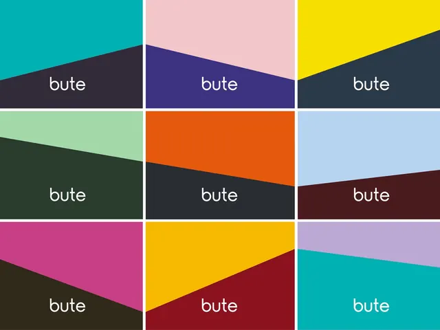
A 3x3 grid where each cell splits into two vibrant colors along a diagonal, with the white wordmark bute positioned across the diagonal divide.
Summary
A bold identity system using a 3x3 grid modular structure where each cell contains two contrasting colors split by a diagonal line, with white wordmark text anchored to the geometric divide.
Visual description
Nine squares arranged in a 3x3 grid, each bisected by a diagonal line creating two distinct color zones. Colors range across vibrant teals, magentas, yellows, oranges, purples, greens, and neutrals, with no two cells sharing the same color combination. The white sans-serif wordmark "bute" sits centered on or near the diagonal boundary in each cell, creating visual tension between the typography and the geometric split. White gridlines separate all cells with precision.
Key takeaway
The diagonal split is the design's core move: it transforms a simple color grid into a dynamic, sophisticated system where the wordmark acts as an anchor point between contrasting hues. This creates a modular identity that feels both systematic and energetic.
Reuse notes
Strong for brands targeting design or creative sectors seeking a contemporary, geometric aesthetic. Each cell can function independently as a pattern tile, or the full grid works as a unified brand mark or brand book cover. The diagonal concept scales to applications like business cards, packaging divisions, or responsive layouts where geometric precision communicates sophistication.
More like this




Keep what you find
A free account saves references to boards and can send you a weekly email of picks based on what you save.
To see every result, go Pro.