Preview image. Unlock full-res
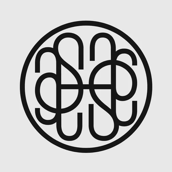
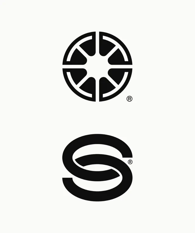
Symmetrical circular monogram composed of interlocking curved strokes forming abstract shapes, housed in a bold circular frame.
Summary
Symmetrical circular monogram composed of interlocking curved strokes forming abstract shapes, housed in a bold circular frame.
Visual description
Eight curved teardrop and semicircular forms interlock at the center, arranged in perfect rotational symmetry around an invisible cross axis. Heavy black outlines (roughly 8-10% of the total mark width) define each element. The strokes meet at clean tangent points with no gaps or overlaps. A thick circular boundary encloses the composition, with even padding on all sides. The negative space is as important as the positive marks, creating multiple closed and open shapes depending on which layer you read. Light background emphasizes the stark black line weight and geometric precision.
Key takeaway
The use of negative space and stroke-overlap technique to create multiple readable shapes from a single unified mark. The balanced weight of the outer circle against the thin-to-medium line weight of the interior elements. The mathematical symmetry that forces every decision to be justified twice, creating a mark that feels both intricate and inevitable.
Reuse notes
Effective for tech, finance, or premium-goods marks where sophistication and precision signal trust. The monogram structure works well for personal or luxury brand identities. Scale well down (icon/favicon) because the line-weight ratio is carefully maintained. Avoid filling with color unless the entire identity system is built around it, as the mark trades heavily on line work and negative space.
More like this


Keep what you find
A free account saves references to boards and can send you a weekly email of picks based on what you save.
To see every result, go Pro.