Preview image. Unlock full-res
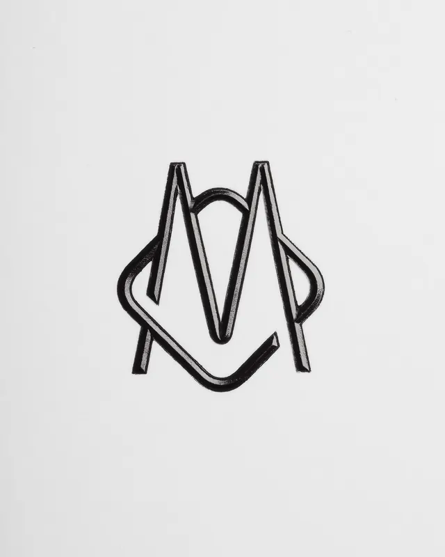
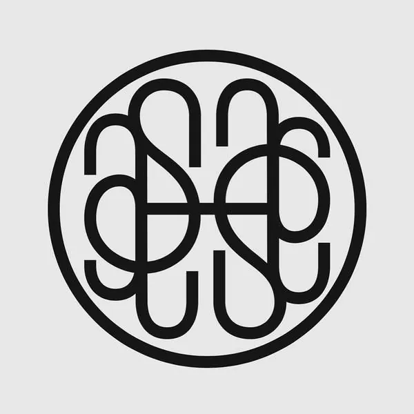
Hand-inked monogram of two overlapping pointed letterforms drawn as thick open outlines in glossy black on bright white stock.
Summary
A single monogram mark built from two sharply pointed letterforms that interlock, rendered as thick open outlines in glossy black ink on white. The defining quality is craft: the strokes look hand-inked, with visible sheen and slight irregularity rather than vector flatness.
Visual description
The mark sits centered and small on a large field of bright off-white paper, leaving generous margins. It reads as two angular, peaked characters woven through each other, their diagonal stems crossing and the lower curves dropping into pointed feet so the overlap forms a symmetrical, almost heraldic shape. Each form is drawn as a double-line outline, an open channel of white running between two glossy black contours, and the ink catches light along the edges. Nothing else is on the page; no wordmark, no color.
Key takeaway
Drawing a monogram as an open outline rather than a solid fill, then printing it in high-gloss black so the strokes pick up reflection. The interlock where two pointed letterforms share crossing diagonals gives a built-in symmetry that feels crafted and bespoke.
Reuse notes
Reach for this on a luxury, fashion, or heritage identity where a hand-made, couture feel matters more than scalability. The glossy-ink-on-paper treatment is a presentation idea as much as a logo. Caveat: open hairline outlines and the gloss effect will not survive tiny sizes or single-color digital use, so a filled fallback would be needed. </content>
More like this


Keep what you find
A free account saves references to boards and can send you a weekly email of picks based on what you save.
To see every result, go Pro.