Preview image. Unlock full-res
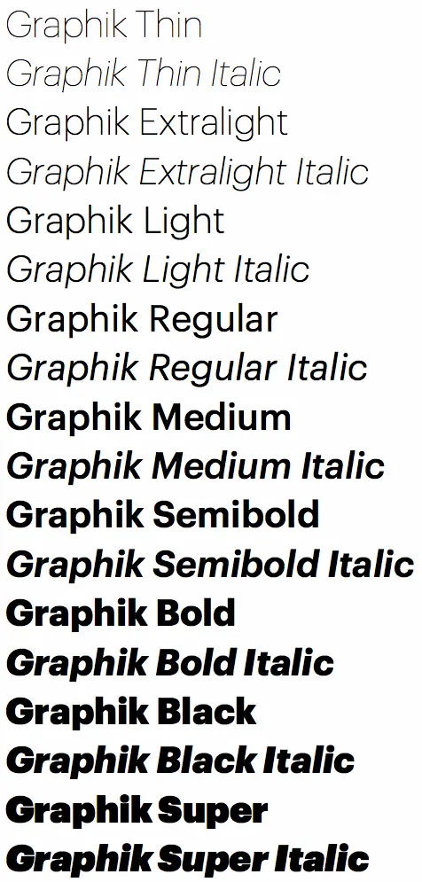
A vertical specimen sheet listing 16 weight/style combinations of the Graphik typeface family, from Thin through Super, showing systematic type hierarchy and design toolkit capability.
Summary
A vertical specimen sheet listing 16 weight/style combinations of the Graphik typeface family, from Thin through Super, showing systematic type hierarchy and design toolkit capability.
Visual description
Pure text composition on off-white background. Left-aligned column of 16 lines, each label naming a Graphik variant: Thin, Thin Italic, Extralight, Extralight Italic, Light, Light Italic, Regular, Regular Italic, Medium, Medium Italic, Semibold, Semibold Italic, Bold, Bold Italic, Black, Black Italic, Super, Super Italic. Each line is set in its own corresponding weight, showing the visual progression from hairline to ultra-heavy. No color, imagery, or layout variation; purely functional display. The specimen relies entirely on stroke contrast to communicate the range.
Key takeaway
The clarity of a linear weight progression: no hierarchy or emphasis, just sequential comparison. Designers can scan vertically to find the right weight. The naming system is consistent and parseable. The monochrome treatment keeps focus on stroke thickness alone. A proven reference for systematic type exploration.
Reuse notes
Ideal for type foundries, design systems documentation, and design toolkit guides. Works well as a printed collateral or a digital type specimen. The vertical list format is easy to scan and compare. Particularly useful when introducing a large font family with many weights.
More like this




Keep what you find
A free account saves references to boards and can send you a weekly email of picks based on what you save.
To see every result, go Pro.