Preview image. Unlock full-res
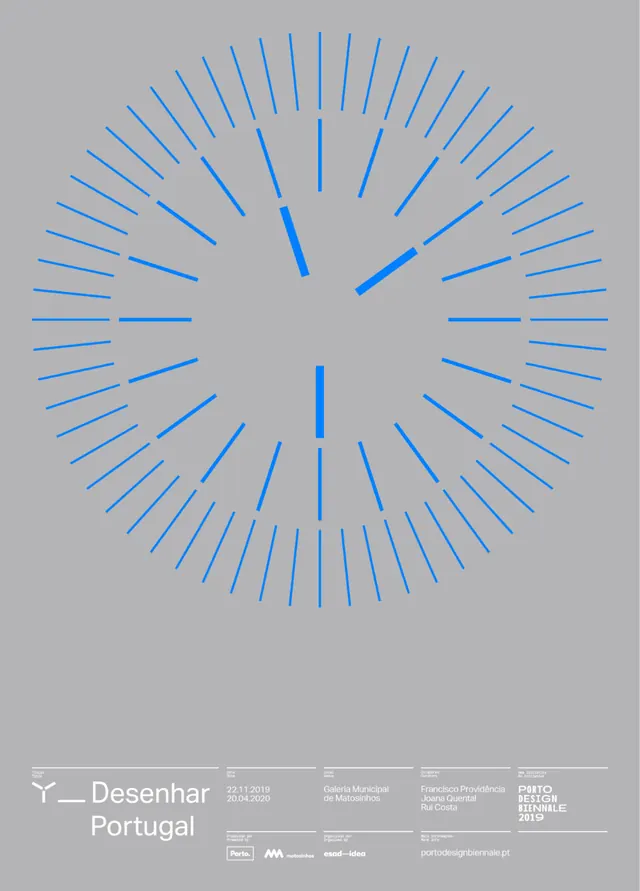
Radial line-art symbol with 24 blue rays and two thicker accent lines centered on a light-gray background, paired with minimal footer branding.
Summary
A radial line-art mark featuring 24 evenly spaced blue rays and two thicker accent lines emanating from center, set on a light-gray ground with minimal footer branding for a Portuguese design studio.
Visual description
A centered radial composition dominates a light-gray background. Twenty-four thin blue lines radiate from a common center point, evenly spaced around a 360-degree axis, resembling a clock face or compass rose. Two of these lines are thicker and darker, serving as a visual accent or axis orientation. At the bottom, a condensed sans-serif footer reads "Desenhar Portugal" followed by small logos and contact information, indicating studio affiliation and context. The overall effect is precise, mathematically ordered, and minimal.
Key takeaway
The radial symmetry as an organizing principle for a mark that reads clean at any size; the use of line weight variation (thick/thin rays) to create visual hierarchy without additional color; the restrained color palette relying on contrast between light ground and medium-blue marks for legibility.
Reuse notes
Effective for tech, design, or educational brands needing a mark that suggests precision, structure, and innovation. The geometric clarity works well at favicon scale and large environmental applications. Pair with a narrow, technical sans-serif and plenty of white space to reinforce the minimalist aesthetic.
More like this







Keep what you find
A free account saves references to boards and can send you a weekly email of picks based on what you save.
To see every result, go Pro.