Preview image. Unlock full-res
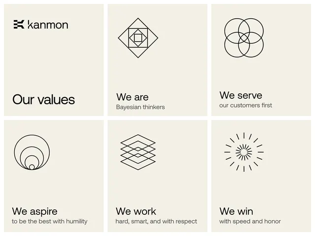
A six-cell brand-values slide for Kanmon on cream, pairing each value statement with a custom geometric line icon in a clean 3x2 grid.
Summary
A "Our values" brand slide that turns six company values into a tidy 3x2 grid, where each cell carries a unique thin-stroke geometric icon above a bold statement and a lighter one-line descriptor.
Visual description
The layout is a six-cell grid on a warm cream ground, separated by faint hairline gutters. The top-left cell holds the Kanmon wordmark with a small bracket-style glyph plus the heading "Our values". The remaining five cells each pair a black line-art icon, centered in the upper half, with text in the lower half: a bold value phrase ("We are", "We serve", "We aspire", "We work", "We win") and a smaller, lighter descriptor below it. The icons are abstract geometric constructions, a nested diamond, overlapping circles, concentric rings, stacked diamonds, and a radial burst, all drawn in a single consistent thin black stroke.
Key takeaway
The pairing of one bespoke thin-line icon per value, all drawn at the same weight and scale, so an otherwise plain text grid reads as a designed system. Anchoring the brand mark inside the same grid as the first cell ties the identity directly to the values rather than floating it above them.
Reuse notes
Reach for this when presenting company values, principles, or service pillars in a deck or about page and you want restraint over decoration. The cream-and-black, single-stroke icon set scales cleanly to web. Keep the icons abstract-geometric so they stay timeless; the format falls apart if the icons drift into literal clip-art.
More like this



Keep what you find
A free account saves references to boards and can send you a weekly email of picks based on what you save.
To see every result, go Pro.