Preview image. Unlock full-res
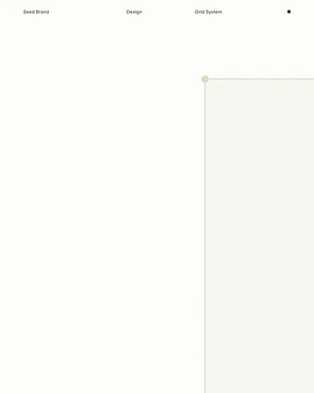
An ultra-minimal cream layout where a thin hairline traces a path from labeled stages, Seed Brand, Design, Grid System, into a faint bordered panel anchored by small dots.
Summary
A near-empty cream canvas that uses one hairline and three tiny labels to diagram a branding workflow, letting negative space do almost all the work.
Visual description
Three small dark sans-serif labels, "Seed Brand", "Design", and "Grid System", run across the top in a single row, with a solid dark dot sitting far to the right of them. Below and to the right, a pale sage hairline draws a right angle: it starts at a small filled circle, runs horizontally, then turns down to outline the top and left edges of a faintly tinted rectangular panel that bleeds off the bottom and right of the frame. The vast majority of the composition is untouched off-white ground; the only contrast is the dark type and the thin green-grey rule.
Key takeaway
The dot-and-hairline as a connective device: a single filled circle marking a node, with a thin rule extending from it to frame a content zone, reads as a system diagram without any boxes or arrows. The deliberate top-aligned label row plus enormous empty body is a confident layout move for process or capability pages.
Reuse notes
Reach for this on agency or studio "how we work" sections, case-study openers, or a brand-process slide where you want restraint. Pairs well with a real screenshot or specimen dropped into the bordered panel. Caveat: the extreme emptiness only holds up at large sizes; it collapses on mobile or as a thumbnail.
More like this


Keep what you find
A free account saves references to boards and can send you a weekly email of picks based on what you save.
To see every result, go Pro.