Preview image. Unlock full-res
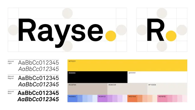
Rayse brand identity specimen showing wordmark lockups at two scales, Akkurat typeface family in three weights, and a structured color palette grid.
Summary
Rayse brand identity specimen showing wordmark lockups at two scales, Akkurat typeface family in three weights, and a structured color palette grid.
Visual description
A vertical brand identity guide spread for "Rayse." The top half shows the wordmark rendered in all-caps sans-serif twice: once at full width and once scaled to initials only, both with pale beige and grey circular ornaments positioned around the text (top, sides, bottom). A yellow dot marks the signature accent color, appearing to the right of the "e" in both lockups.
Below the wordmark section, the left column displays the Akkurat typeface in three weights (Light, Regular, Bold), each showing an italic and roman specimen with numerals. To the right is a structured color palette: a bright yellow bar (#FFCE31) at the top, followed by a neutral row (black, white, grey), then a beige-and-pink band, and finally a ramp of tints and shades ranging from cool blue, magenta, and coral to softer pastels. All hex values and color codes are labeled, and the underlying grid is faintly visible, reinforcing the systematic nature of the identity.
Key takeaway
The ornamental circles (pale background shapes) humanize a strict typographic composition without sacrificing clarity. The scaled-down mark version (initials) proves the concept works at multiple sizes. The color palette is presented both as a discrete list of primaries and as a full tint-and-shade ramp, showing the brand can extend richly without losing coherence. Labeling every element (font names, weights, hex codes) makes this a genuine reference document, not just a pretty picture.
Reuse notes
Strong reference for building a complete brand identity guide from scratch. The pale shapes (subtle circles) are a restrained way to add visual interest without clutter. The Akkurat typeface pairing with geometric shapes suits fintech, B2B software, or modern creative services. The three-weight system offers flexibility without overwhelming the palette. Works well for both print and screen due to the black-on-white foundation and deliberate accent color. The grid format makes it easy to spec in production.
More like this



Keep what you find
A free account saves references to boards and can send you a weekly email of picks based on what you save.
To see every result, go Pro.