Preview image. Unlock full-res
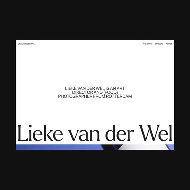
Minimalist portfolio homepage with large serif name, small-cap navigation, and accent bar of bright cobalt blue.
Summary
Minimalist portfolio website anchored by a large serif name, clean small-cap navigation, and a bright cobalt blue accent bar at the footer.
Visual description
A white card occupies the center of a black background. At the top sits a small-cap sans-serif header, "LIEKE VAN DER WEL", left-aligned in gray. Navigation items (PROJECTS, ENGLISH, ABOUT) are right-aligned in the same serif weight. The card body is dominated by centered text in small caps: "LIEKE VAN DER WEL IS AN ART DIRECTOR AND (FOOD) PHOTOGRAPHER FROM ROTTERDAM." Below that, a large bold serif name "Lieke van der Wel" breaks across two lines, set in a generous size. The composition is balanced entirely through typography and white space. A horizontal band of bright cobalt blue accents the lower edge, adding a single moment of color contrast.
Key takeaway
The discipline of typographic-only hierarchy without imagery. The serif nameplate creates instant authority and personality. The single bright-color accent bar at the footer provides visual interest and rhythm without overwhelming the minimal palette.
Reuse notes
Strong default for portfolio sites, creative services, and photography brands where personality lives in the name and navigation stays restrained. Works well for architect, designer, photographer, and art director portfolios. Requires confident typography and a strong name to carry the design.
More like this

Keep what you find
A free account saves references to boards and can send you a weekly email of picks based on what you save.
To see every result, go Pro.