Preview image. Unlock full-res
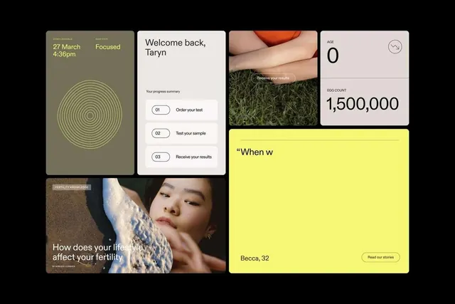
Fertility tracking app screens combining warm earth tones, concentric circles, skin/plant imagery, and a bright yellow accent block.
Summary
A fertility health app UI system combining warm sage and olive tones, concentric-circle motifs, photography of skin and nature, and a bold lime-yellow accent card to create a calm, human-centered experience.
Visual description
Six app screens arranged in an asymmetric grid. Upper left shows a soft olive-sage card with concentric golden-yellow circles filling the space, labeled with a date, time, and "Focused" status. Upper middle displays a white card with "Welcome back, Taryn" greeting and a three-step numbered progress summary (Order your test, Test your sample, Receive your results). Upper right pairs skin close-up photography with a small beige card showing "AGE 0" and "EGG COUNT 1,500,000." Lower left depicts a moody photograph of a woman's face with sand texture and a text overlay: "How does your lifestyle affect your fertility." Bottom right is a large lime-yellow block with partial text ("When w") and a call-to-action button, sized prominently to break the grid.
Key takeaway
The concentric circle mark creates organic visual continuity without feeling clinical. The pairing of intimate skin/nature photography with warm earth-tone cards keeps the health topic feeling human rather than medicalized. The bright yellow accent functions as an emotional lift and draws focus to key information. The modular card system allows complex health data to be presented in digestible steps.
Reuse notes
Strong system for health-tech, wellness apps, and fertility-specific products. The warm palette and organic shapes work well for intimate health topics. Works across tracking apps, appointment systems, and health education flows. The numbered-steps pattern suits onboarding and process-driven features. Be cautious with scale on the bright-yellow accent; it should highlight, not dominate.
More like this




Keep what you find
A free account saves references to boards and can send you a weekly email of picks based on what you save.
To see every result, go Pro.