Preview image. Unlock full-res
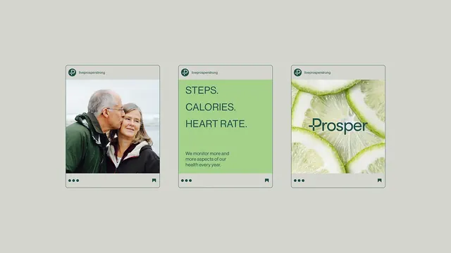
A three-card mobile onboarding sequence for a health-tracking app (Prosper) with soft neutrals, lime-green accents, and real-world imagery paired with organic typography.
Summary
A three-screen mobile onboarding carousel for a health app, alternating photography with typographic callouts: real-world couple photo, bright-green "steps, calories, heart rate" feature list, and soft macro photo of plant cells with the app logo.
Visual description
Three identical-width cards in a horizontal carousel. Card 1: beige border, close-up headshot photo of an older couple (warm, intimate). Card 2: vibrant lime-green background, dark olive sans-serif headlines stacked tight ("STEPS." "CALORIES." "HEART RATE."), muted dark-olive body copy below. Card 3: beige border, soft-focus macro photograph of lime-green plant tissue filling the frame, dark-teal serif wordmark "Prosper" overlaid lower-left. All cards share a light-gray top header bar showing the app name "liveprosperstrong", and a dot carousel indicator below. Rounded corners throughout.
Key takeaway
Alternating photography and type across onboarding steps holds attention. The lime-green accent color is vibrant enough to pop against neutrals without being neon, and ties naturally to the plant/wellness macro imagery. Serif on green (not sans) adds intention and premium feel. Using real intimate human photography builds trust for a health app.
Reuse notes
Effective for health/wellness/fitness app onboarding. The light neutral card frames make photographs feel deliberate and curated. Pair lime/green accents with soft photography and muted text for a calm, science-backed vibe. Works well for feature introductions (what this app does) before the payoff (signup or start).
More like this




Keep what you find
A free account saves references to boards and can send you a weekly email of picks based on what you save.
To see every result, go Pro.