Preview image. Unlock full-res
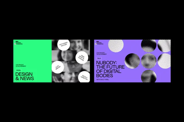
A media brand identity using a hard vertical split between lime green and purple, with typographic hierarchy, textured spheres, and responsive layout across three distinct panels.
Summary
A media brand identity using a hard vertical split between lime green and purple, with typographic hierarchy, textured spheres, and responsive layout across three distinct panels.
Visual description
Three vertical panels arranged left to right, all on a black background. Left panel is lime green with dark text reading "DESIGN & NEWS" in stacked all-caps sans-serif, and a cropped greyscale photographic element. Center panel is neutral grey-white with overlaid white circular shapes (spheres with subtle shading) and snippets of small body text. Right panel is deep purple with all-caps sans-serif reading "NOBODY: THE FUTURE OF DIGITAL BODIES" and a matching set of white and black textured spheres. Each panel demonstrates a different typographic treatment (headlines, body, labels) in consistent sans-serif weights but varying sizes and alignment, creating a modular, extensible system.
Key takeaway
The aggressive color split (lime vs. purple) that reads as modern and high-energy without feeling chaotic; the spherical texture elements that add visual dimension while remaining abstract and reproducible; the three-column structure that showcases flexibility of a single typeface system across different sizes and contexts.
Reuse notes
Ideal for media, tech, or news-adjacent brands that need to project innovation and energy. The duotone approach pairs well with photographic imagery (as shown) but the typography and textures alone carry the design. The split-screen language suggests a before/after, binary choice, or complementary concepts, making it effective for editorial or platform branding.