Preview image. Unlock full-res
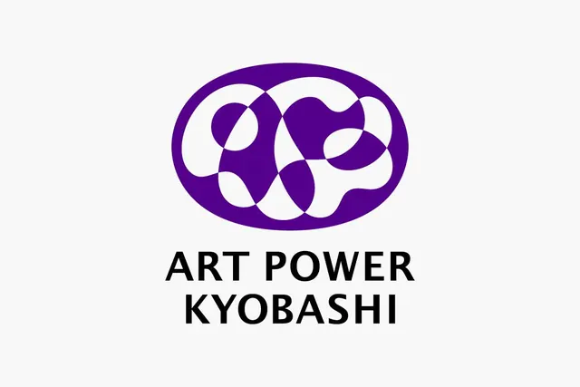
An interlocking abstract mark for Art Power Kyobashi in rich purple, composed of organic curved shapes arranged in a balanced oval within a solid circle.
Summary
An interlocking abstract mark for Art Power Kyobashi in rich purple, composed of organic curved shapes arranged in a balanced oval within a solid circle.
Visual description
A deep-purple oval frame encases a collection of interlocking curved forms, white and purple alternating. The shapes suggest motion or dance, flowing smoothly without sharp corners. The composition is symmetrical along a vertical axis: circular nodes anchor the top and bottom, while curved segments wind between them. Below, ART POWER KYOBASHI is set in heavy black sans-serif, all-capitals, centered and tightly spaced. The mark sits on a very light gray background, the purple reads as a rich jewel tone against both the near-white field and the black text.
Key takeaway
The interlocking approach makes the mark feel like it could represent collaboration or multiple voices. The organic curves soften what could otherwise feel corporate or cold. The purple-in-oval device is elegant and contained, giving the complex internal forms a clear boundary. This structure scales from small (social media) to large (signage) without losing legibility.
Reuse notes
Ideal for arts organizations, creative agencies, cultural institutions, or tech companies wanting a sophisticated, dynamic look. The purple reads as creative, premium, and contemporary. Avoid laying type directly over the mark; the centered layout here works well. Works better on light backgrounds; the purple depth can flatten on dark.