Preview image. Unlock full-res
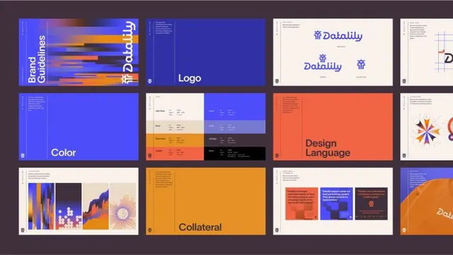
A modular brand-guidelines system for Datalily featuring complementary royal blue and warm orange with geometric bar patterns, applied across logo, color rules, design language, and collateral templates.
Summary
A modular brand-identity system featuring a geometric bar-pattern language in royal blue and warm orange, with dedicated guidelines pages for logo, color palette, and design language paired with sample collateral applications.
Visual description
Grid of 12 brand-guideline mockup pages on a dark gray background. Top left shows the cover page "Brand Guidelines" with the Datalily logo in white on an electric blue background overlaid with horizontal orange, red, and gold bars. Next page shows the logo lockup on solid blue. Third page displays the Datalily wordmark in blue on cream with logo variations and spacing rules. Fourth shows a geometric grid pattern guide. Middle row: a full blue page for color guidelines; a cream page with color swatches showing the primary royal blue and secondary palette of warm orange and coral tones; a bright coral-orange page titled "Design Language" with sample color blocks; a multicolored page showing abstract geometric illustrations (sunburst, wavy patterns, vertical bars) as pattern references. Bottom row: a cream page with vertical bar patterns in blue and orange; a full golden-orange collateral page; a white page showing sample applications of the brand on business cards and backgrounds in blue, orange, and coral; and a partially visible page in orange. All pages use clean sans-serif type and maintain consistent spacing and hierarchy.
Key takeaway
The horizontal bar motif (like sound waves or data streams) becomes a connective visual language deployed across every application, creating instant recognition without oversaturation. Blue and orange are high-contrast but warm-adjacent, allowing the palette to feel both tech-forward and approachable. A dedicated "Design Language" page goes beyond color rules to show abstract pattern and illustration direction, giving designers room to extend the system.
Reuse notes
Strong model for data-forward or tech-industry brands (SaaS, analytics, fintech) where a playful-but-professional tone is needed. The geometric bar language translates well to data visualization, charts, and dashboards. The cream-colored guidelines pages provide breathing room and legibility; the full-color pages demonstrate bold application. Best suited for companies comfortable with a vibrant, energetic secondary color and geometric abstraction.
More like this

Keep what you find
A free account saves references to boards and can send you a weekly email of picks based on what you save.
To see every result, go Pro.