Preview image. Unlock full-res
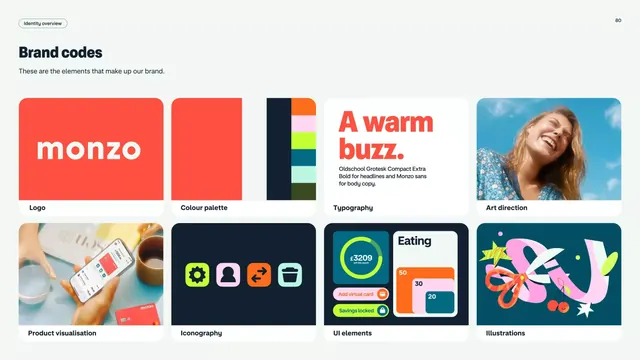
Comprehensive brand identity guide page showing logo, color palette, typography, UI elements, art direction, and illustration style in a structured two-column grid.
Summary
A brand identity systems reference page titled "Brand codes" displaying logo, color palette, typography, UI kit, art direction, and illustration style across a structured two-column grid layout.
Visual description
Light gray background containing a hierarchical grid layout. The page header reads "Brand codes" with subtext "These are the elements that make up our brand." Six distinct content blocks are arranged in a two-column, three-row grid. Top left: a large red-orange rounded rectangle containing "monzo" in white sans-serif (the primary logo). Top middle: three color swatch blocks in navy, white, and orange against gray. Top right: a full-color portrait of a smiling woman with blue sky background labeled "Art direction." Middle left: a flat illustration showing hands with phone, labels, and color swatches labeled "Product visualization." Middle center: navy background with four stacked icons in bright colors labeled "Iconography." Middle right: a UI mockup with lime-yellow backgrounds, orange circle, and teal elements labeled "UI elements." Bottom left: blank (implied fourth quadrant). Bottom right: a vibrant flat illustration of a woman with colorful abstract shapes and tropical elements labeled "Illustrations." All typography is clean, sans-serif, sans ornament. The color palette is high-contrast and modern, balancing warm (orange, coral) with cool (navy, teal) tones.
Key takeaway
The modular card system clearly separates brand dimensions (logo, color, type, UI, imagery) without overwhelming the viewer. The two-column grid is flexible and scalable. The system demonstrates diverse applications in a single page: photography, iconography, illustration, and UI all under one coherent language. The contrast between bright accent colors and neutral backgrounds keeps the page organized despite visual density.
Reuse notes
Exceptional reference for fintech, health tech, and consumer app branding that needs to show personality through photography and illustration alongside clean UI. The card-based layout translates well to interactive digital brand guidelines. The warm-cool color strategy (orange energizes, navy grounds, teal humanizes) is replicable across industries. Best used as a presentation or guide document rather than an executable logo-only asset.
More like this
Keep what you find
A free account saves references to boards and can send you a weekly email of picks based on what you save.
To see every result, go Pro.