Preview image. Unlock full-res
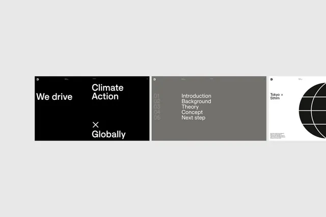
Minimalist corporate type system for sustainability brand using stark black/gray/white palette with clean sans-serif, numbered navigation, and circular geometric forms.
Summary
A minimal environmental-focused type system using stark black, white, and gray with numbered navigation structure and geometric circular elements.
Visual description
Three pages from a corporate identity system. Left: black cover with bold white sans-serif headlines stating "We drive" and "Climate Action" stacked vertically, with an "x" symbol and "Globally" below. Center: gray background page with light-gray numbered list (01-05) showing section headings like "Introduction," "Background," "Theory," "Concept," and "Next step" in white sans-serif. Right: white background with the circular geometric mark (overlapping arcs) in black and a small "Tokyo x Shim" identifier. The overall approach prioritizes negative space and typographic hierarchy over decoration.
Key takeaway
The numbered section navigation as a simple structural device that works across pages. The geometric circular logoform that reads as forward-motion yet remains minimal. The restrained black/white/gray palette that gives serious, sustainable-focus messaging without color.
Reuse notes
Strong for corporate identities in fintech, ESG reporting, or sustainability sectors where seriousness and clarity matter more than visual noise. The geometric circular forms work well for brands claiming innovation or forward progress. Works best when accompanied by high-quality photography or data visualization to add visual richness.
More like this




Keep what you find
A free account saves references to boards and can send you a weekly email of picks based on what you save.
To see every result, go Pro.