Preview image. Unlock full-res
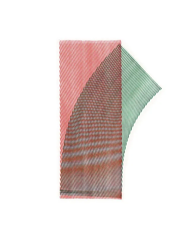
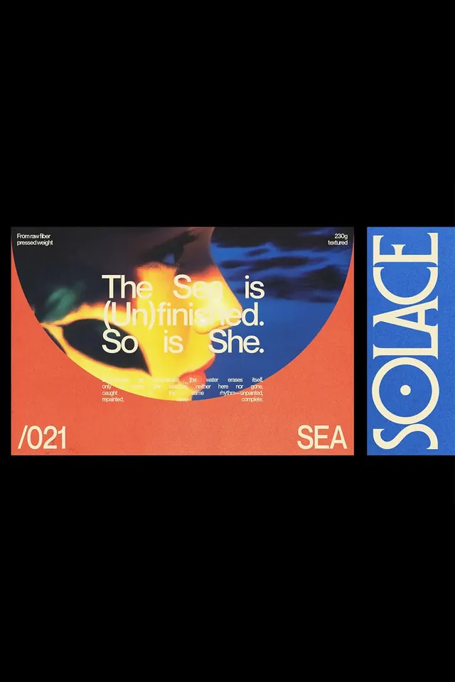
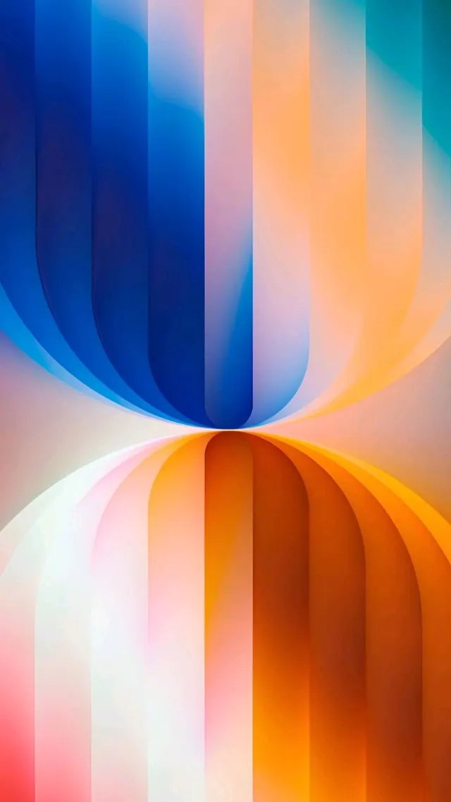
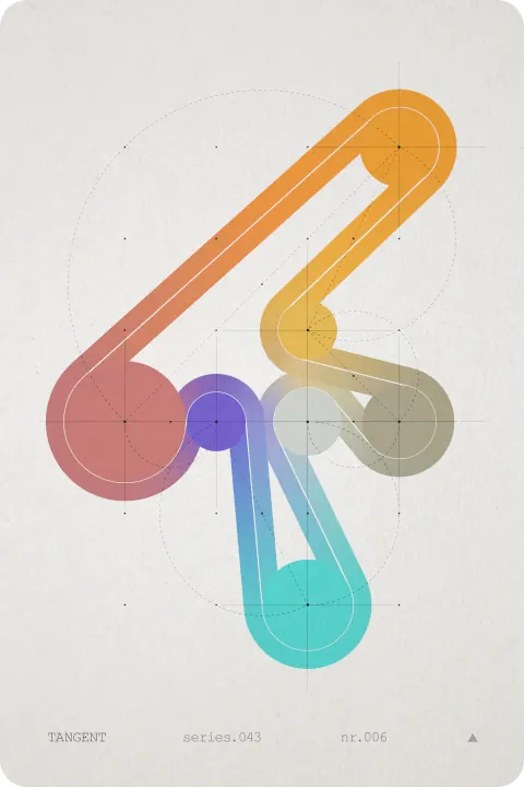
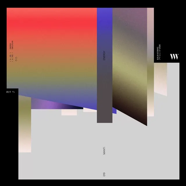
A layered abstract composition with large geometric color fields that shift from warm reds and oranges through cool purples and grays to muted earth tones, suggesting a gradient-based design exploration.
Summary
An abstract color composition built from large overlapping geometric fields that transition through a warm-to-cool gradient palette, suggesting a study in color harmony and spatial relationships.
Visual description
The composition is layered with bold, overlapping rectangles and angled planes of color. A large warm field dominates the upper left (bright red fading to orange and gold), while cool zones (deep purple, slate gray, olive) occupy the right and center. Smaller pastel blocks (soft pink, pale beige, light gray) accent the composition. Small labels and notations appear in corners and along edges, in tiny serif type. The arrangement creates visual depth through color temperature shifts and subtle gradations within each field, moving from vivid tones to muted, almost monochromatic sections. The overall effect is of a working study or mood palette.
Key takeaway
The controlled clash of warm and cool color zones to create visual tension and movement; the use of large geometric fields to explore color relationships without representational form; the restraint of small typography annotations that contextualize the color study without dominating it.
Reuse notes
Useful for developing brand color palettes, exploring gradient transitions, or creating abstract identity systems where color is the primary communication tool. Works for design-forward agencies, creative consultancies, or experimental branding work. The mood is contemplative and analytical rather than commercial, so best paired with sophisticated, technical, or artistic brands.