Preview image. Unlock full-res
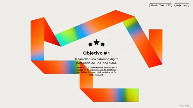
Abstract geometric logo formed by interlocking rainbow-gradient ribbon shapes in orange, blue, yellow, and green on a light background.
Summary
A geometric logo mark built from interlocking ribbon shapes, each filled with a smooth rainbow gradient flowing from orange through cyan to yellow and back.
Visual description
Five or six flat ribbon shapes in bright coral-orange interlock to form a centered, upright abstract mark. Each ribbon is filled with a smooth horizontal gradient shifting from orange on the left through cyan and electric blue to yellow-green on the right. The ribbons curl and overlap to create visual rhythm and the illusion of motion. Above the mark, two rounded pill-shaped labels read "Diseno Textil II" and "Objetivos" in black sans-serif. Below the mark sits centered text starting with three black stars, then "Objetivo #1" as a heading, followed by Spanish body copy in narrow green-highlighted lines. The background is a neutral off-white.
Key takeaway
The layered ribbon technique creates a mark that reads as both flat and three-dimensional. The smooth gradient flowing across ribbon edges unifies the piece despite its geometric fragmentation. The mark stands strong without requiring a wordmark beside it.
Reuse notes
Excellent reference for tech, creative, or innovation-focused brands where motion and fluidity matter. The rainbow gradient feels contemporary but risks dating quickly. The mark is bold enough to work as a standalone logo or as a system component. The color harmony across the gradient creates cohesion without feeling chaotic.
More like this

Keep what you find
A free account saves references to boards and can send you a weekly email of picks based on what you save.
To see every result, go Pro.