Preview image. Unlock full-res
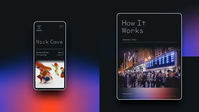
Two dark digital screens, a phone event page and a tablet how it works page, floated over a black backdrop with blue and red gradient corners.
More like this
See all
Summary
Two dark product screens shown side by side at different scales and heights, both built from a thin geometric sans, hairline rules and one full width photograph.
Visual description
A black frame with soft blue, violet and red gradient blooms in the lower left and right corners. At the left, a phone in a white outline frame shows a near black screen: a small three line wordmark reading "ART ON THE MART" in letterspaced thin caps at the top left, a three bar menu icon at the top right, then a large "Nick Cave" headline in a very light wide geometric sans, a hairline rule, and a two column row listing "Ba Boom Boom Pa Pop Pop" against "May 5 to Oct 2". Below that sits a photograph of figures in brightly colored full body fur costumes on a white ground. At the right, a larger tablet in the same white outline frame is set higher in the frame and shows "How It Works" as a two line headline in the same light sans, a small all caps label "TECHNOLOGY + DETAILS" above a hairline rule, then a wide night photograph of a crowd on a street watching an illuminated facade. A second label, "TOP TECH FACTS", sits below the image over a gradient strip, above another hairline rule.
Key takeaway
The whole interface is carried by one hairline weight: the rules, the device outlines and the strokes of the typeface all read at the same thinness, which makes the two photographs the only heavy elements on the page. Offsetting the two devices vertically instead of aligning them keeps a two device shot from looking like a spec sheet.
Reuse notes
A useful reference for arts and cultural web design where listings, dates and photography have to coexist on black. The extremely light typeface needs generous size and a true black background to stay readable, and it will fail accessibility checks at small sizes or on lighter grays.