Preview image. Unlock full-res
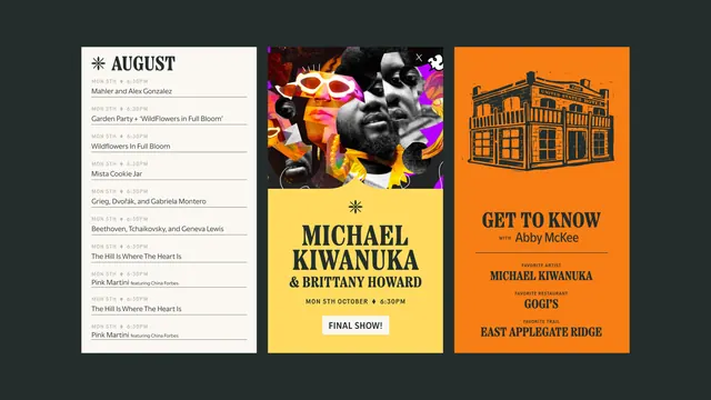
Three vertical festival screen templates side by side on charcoal green, covering a monthly schedule, an artist announcement collage and an orange editorial card.
More like this
See all
Summary
Three tall festival screens presented together on a deep charcoal green field, each one a different content template built from the same asterisk mark, heavy serif display type and a small caps meta line.
Visual description
Left panel is cream: an asterisk sits beside the word AUGUST in a bold serif, then ten schedule rows, each a small caps date and time line above an event title with a hairline rule under it. Center panel is split: the top half is a saturated cut and paste collage of performer photographs mixed with magenta, purple and yellow shapes, with a small close icon in the corner; the bottom half is butter yellow and carries the asterisk, a three line artist billing in bold serif, a small caps date line and a white pill button reading FINAL SHOW. Right panel is orange with a black linocut style drawing of a corner hotel building above a GET TO KNOW headline, a script styled name, a rule, and three small caps label plus answer pairs. All three sit as equal width columns with generous dark space around them.
Key takeaway
One display serif plus one small caps sans covers a dense listing, a loud announcement and a light editorial card without any of them looking like a different brand. The asterisk is the only mark that repeats, and it is enough to tie the set.
Reuse notes
A good reference for building a festival or event content kit where the same grid has to carry schedules, artist reveals and soft human interest posts. The collage panel needs strong source photography to work; the schedule and editorial panels hold up on type alone.
More like this

Keep what you find
A free account saves references to boards and can send you a weekly email of picks based on what you save.
To see every result, go Pro.