Preview image. Unlock full-res
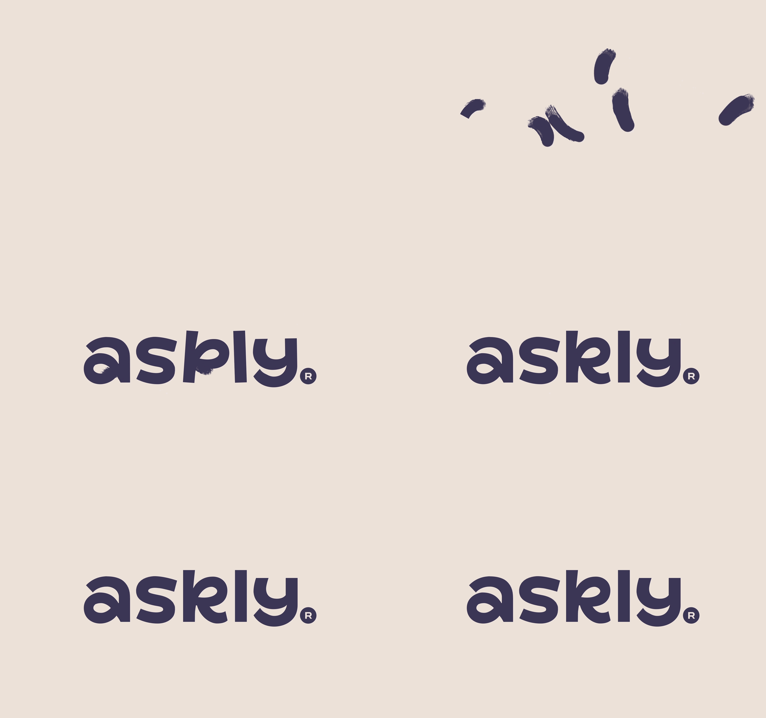
An animated logo reveal in which loose ink brush marks resolve into a rounded lowercase "askly." logotype on a warm cream field.
More like this
See all
Summary
An animated logotype reveal on a warm cream ground: scattered dark ink dabs grow into brush strokes and settle into the word "askly." in a soft rounded lowercase sans.
Visual description
The field is a flat warm cream that fills the whole frame and never changes. The animation opens empty, then a handful of small dark ink dabs appear at irregular positions across the middle band, reading at first as unrelated marks. They extend into curved brush strokes with visibly dry, ragged ends, still not spelling anything. The strokes then close up into finished letterforms and the word "askly." lands centered: a rounded geometric lowercase sans in a deep desaturated navy-purple, wide apertures, generous letter spacing, a single-storey a, a k with a curved leg, and a descending y. A solid dot follows the l-y pair as a terminal period, and a very small circled R sits at the baseline to the lower right of it. Nothing else enters the frame at any point: no tagline, no symbol, no descriptor.
Key takeaway
The reveal earns its ending by starting illegible. Because the first marks read as random ink rather than partial letters, the moment they snap into a word does the work, and the brushy stroke ends survive into the final mark so the logotype keeps a handmade trace instead of looking purely vector. Holding a single flat cream ground for the entire loop means the animation reads as one idea and not a sequence of scenes.
Reuse notes
Good reference for a friendly software or service brand that wants warmth without being childish, and for logo reveals that need to work as a short silent loop on a site header or social post. The construction depends on a mark whose letterforms can credibly be drawn with a brush, so it will not transfer to a tightly grid-built or geometric-perfect logotype. Note that the first frame is blank cream, which makes it a poor choice anywhere a static thumbnail is pulled from frame one.
More like this

Keep what you find
A free account saves references to boards and can send you a weekly email of picks based on what you save.
To see every result, go Pro.