Preview image. Unlock full-res
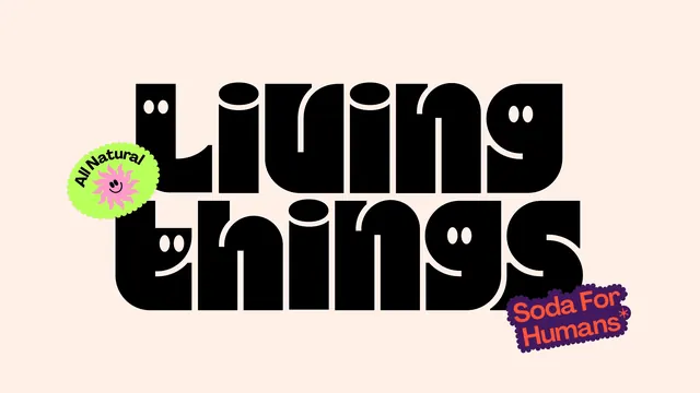
The full wordmark set huge in black rounded display type with smiling faces cut into the counters, flanked by two brand stickers on cream.
More like this
See all
Summary
The wordmark presented alone at maximum size, a two-line black lockup in a very heavy rounded display face whose letter counters are drawn as small smiling faces.
Visual description
On a warm cream ground, the brand name is set across two lines in solid black, filling almost the full width of the frame. The face is extremely heavy with swollen strokes, flat terminals and near-zero apertures, and the two lines are optically fitted so the descender-free baseline of the first sits tight above the second. Several round counters are replaced with a pair of oval eyes and a curved smile, so individual letters read as faces without breaking the word. Lower case throughout, tracking close to touching. Bottom left of the type sits a lime green scalloped sticker reading "All Natural" curved along the top with a pink smiley sun below. Bottom right, a deep purple wobbly-edged sticker carries "Soda For Humans" in coral on two lines with an asterisk. Nothing else is on the canvas.
Key takeaway
Building the smile into the negative space of the letterforms means the personality survives wherever the wordmark goes, with no mascot or secondary graphic required. The two stickers sit outside the lockup rather than inside it, keeping the mark itself clean for small applications.
Reuse notes
A good reference for consumer brands that want charm without an illustrated character. The face-in-counter trick needs very heavy weights and generous counters to survive reduction, so keep a plain fallback wordmark for small sizes and embossing. The cream ground is part of the recipe: on white the mark looks harsher.