Preview image. Unlock full-res
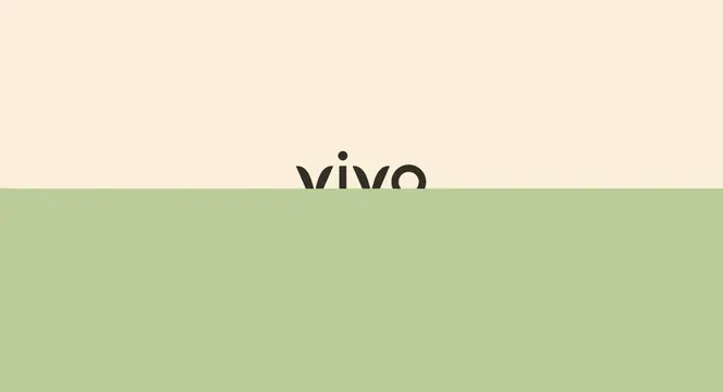
The lowercase vivo wordmark sitting on the seam between a cream upper half and a sage green lower half, cropped by the colour break.
More like this
See all
Summary
A wordmark presentation frame in which the logo is deliberately cut in half by a hard horizon between two flat brand colours.
Visual description
The frame is split by a single straight horizontal edge slightly below center: warm cream above, soft sage green below. The dark charcoal "vivo" wordmark is centered on that edge, sized small relative to the frame, with roughly its lower half hidden beneath the green. What remains visible are the tops of the letters: two open v shapes with rounded geometric terminals, the free-floating round dot of the i, and the upper arc of the o. No other element appears, no strapline, no mark, no caption, and margins on both sides are enormous.
Key takeaway
Trusting the reader to complete a half-hidden wordmark is the flex here, and it only works because the letterforms are geometric enough to be guessed from their tops. The colour seam doubles as a horizon, which suits a brand built on growing things.
Reuse notes
Good for a title card, a slow reveal on a website hero, or a divider inside a brand book. The crop needs a wordmark with distinctive ascender shapes, so it fails on generic grotesques. Never use this treatment where the name is not already known to the viewer.