Preview image. Unlock full-res
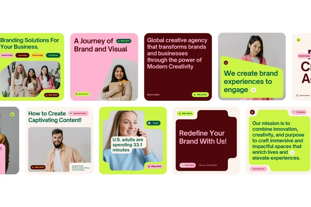
A grid of service cards using pastel background blocks and photography to present a creative agency's brand and service offerings.
Summary
A modular grid of six service cards in soft pastels and white, each pairing a bold headline with a portrait photo, presenting a creative agency's offerings.
Visual description
Six rectangular cards arranged in a two-row grid, each with a distinct pastel background (bright lime-green, pale pink, deep maroon, white, or muted beige) and a centered portrait photo of a person. The headline sits above or overlaid on each photo in heavy sans-serif type. Service topics include "Branding Solutions," "A Journey of Brand and Visual Content," and "We create brand experiences." Type treatment uses high-contrast dark text on light backgrounds and reversed white type on dark cards. Padding is generous around the photos and text, creating visual breathing room typical of contemporary B2B design.
Key takeaway
The pastel color system as a differentiator without sacrificing professional credibility. Mixing bold, concentrated color (maroon card) with near-white reduces saccharine tendencies. The portrait photography humanizes an otherwise minimal grid. White space inside each card prevents overcrowding despite type and image.
Reuse notes
Strong template for creative service brands, agencies, and consulting firms. The portrait photography is critical for trust and approachability; replace with relatable, diverse, professional headshots. The maroon card demonstrates that deeper colors can work within a pastel palette if used sparingly. Scales down well to mobile due to its card-based modularity.
More like this




Keep what you find
A free account saves references to boards and can send you a weekly email of picks based on what you save.
To see every result, go Pro.