Preview image. Unlock full-res
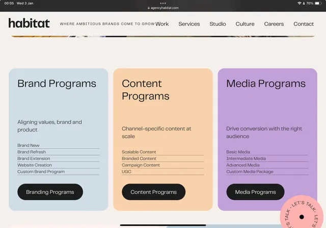
Agency services page displaying three program cards in muted pastel colors (blue, peach, lavender) with black text on a warm off-white background.
Summary
Agency services page with three program cards in soft pastels, anchored by black rounded buttons and organized hierarchical text on a warm off-white background.
Visual description
A horizontal navigation bar sits at the top with the Habitat wordmark (black, sans-serif) and navigation links. Below, a colorful dividing stripe transitions across orange, steel blue, and other hues. The main content area displays three equally-sized rounded-corner cards arranged side-by-side: the first pale blue labeled "Brand Programs," the second soft peach labeled "Content Programs," and the third lavender labeled "Media Programs." Each card contains a bold headline, descriptive subheading, a bulleted list of program types in smaller text, and a black rounded-button CTA at the bottom anchoring the card. All text is sans-serif and dark.
Key takeaway
The soft, high-contrast pastel palette creates visual separation and hierarchy without heaviness. The consistent card structure and centered CTA buttons provide clear scanability and actionability. The warm off-white background unifies the three distinct color zones without competing.
Reuse notes
Strong reference for B2B service pages, agency brands, or any multi-program marketing website. Works best when program offerings need equal visual weight. The pastels feel approachable without sacrificing professionalism. The dividing stripe at the top is a subtle way to introduce secondary colors.