Preview image. Unlock full-res
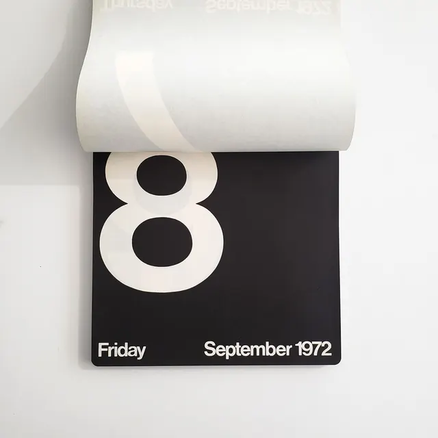
A modernist calendar card with a large centered numeral, legible sans-serif type for the date, and a heavy black background, suggesting Swiss design discipline of the 1970s.
Summary
A 1972 calendar card using Swiss modernist discipline: a large cream-colored numeral 8 floating centered on black with minimal sans-serif date text anchoring the base.
Visual description
Glossy black rectangular card (appears to be 3D-rendered or photographed) with a pure white/cream sans-serif numeral 8 positioned in the optical center. The type is generous and geometric, letting negative space do the balancing work. At the base, white sans-serif letters spell "Friday" on the left and "September 1972" on the right in smaller point, flush with the bottom corners. A cream-colored scroll of paper (likely a tear-off calendar mechanism) is visible curled at the top edge, reinforcing the functional object. The lighting and shadow suggest a physical artifact photographed against white.
Key takeaway
The restraint: one number, two text elements, one color inversion. The numeric visual anchor vs. the typeset information creates immediate hierarchy without decoration. Swiss-grid alignment (center, base-left, base-right) reads as intentional and timeless.
Reuse notes
Pair with calendar and scheduling applications, or retro/archival branding where modernist purity signals integrity. The color inversion (light numeral on dark) works for film posters, countdown sequences, or event systems that need to feel authoritative. Less useful in consumer contexts; strongest when formality is the message.
More like this





Keep what you find
A free account saves references to boards and can send you a weekly email of picks based on what you save.
To see every result, go Pro.