Preview image. Unlock full-res
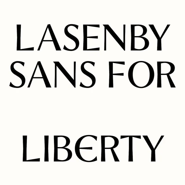
Vertical type specimen showcasing Lasenby Sans For in high-contrast black sans-serif across three right-aligned lines on white.
Summary
A striking type specimen of Lasenby Sans For presented in three right-aligned blocks of uppercase letterforms on a clean white ground, demonstrating geometric precision and maximum legibility.
Visual description
Three words in pure black set in a geometric sans-serif: LASENBY, SANS FOR, and LIBERTY stacked vertically and aligned to the right, each on its own line. The typeface is ultra-clean with straight terminals and even stroke weight throughout. Generous white space surrounds the text, with the composition perfectly balanced by asymmetric right alignment. The letterforms are large and commanding, occupying roughly half the vertical canvas while the right edge remains unmarred.
Key takeaway
The discipline of right alignment creating dynamic asymmetry without introducing shape variation, ideal for editorial layouts. The typeface's geometric clarity makes text a pure compositional element rather than secondary to imagery. Perfect reference for minimal branding where type is the hero.
Reuse notes
Strong reference for high-end editorial, luxury branding, and minimal identity systems. Best for headlines or hero text where legibility and precision matter more than warmth. Pairs well with generous whitespace and photography-forward layouts.
More like this




Keep what you find
A free account saves references to boards and can send you a weekly email of picks based on what you save.
To see every result, go Pro.