Preview image. Unlock full-res
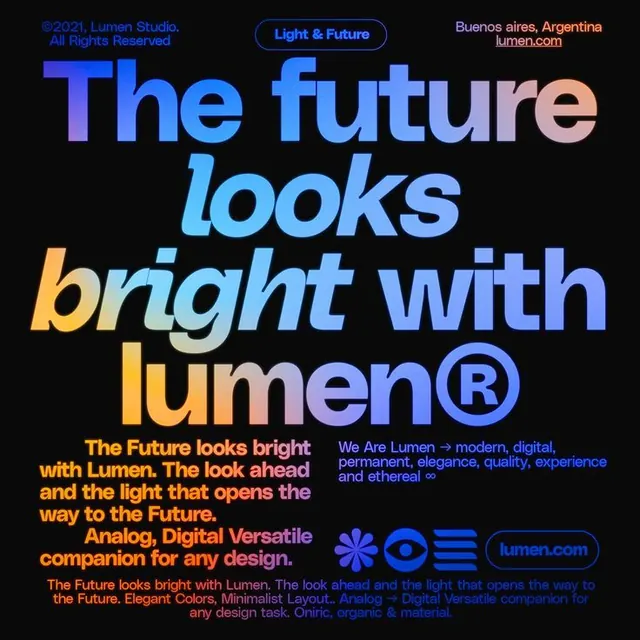
Lumen Studio's brand manifesto uses a bold oversized headline in vibrant gradients (blue to purple to orange) flowing across a black background with supporting copy and symbolic icons below.
Summary
Lumen Studio's brand statement wraps the declaration "The future looks bright with lumen" in a flowing gradient (electric blue through purple to warm peach) in massive sans-serif over black.
Visual description
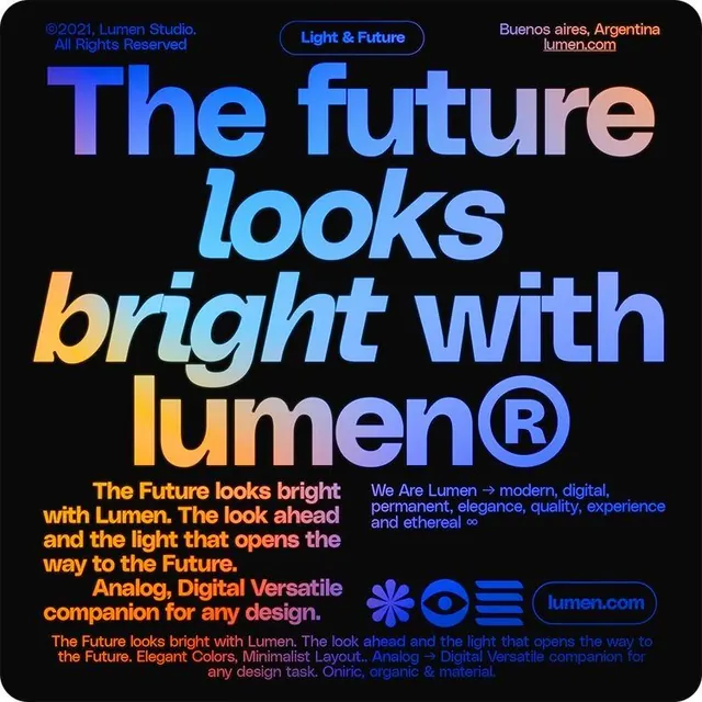
Jet-black background anchoring three layers of content. The dominant layer is a massive sans-serif headline split across four lines in multiple gradient colors: "The" and "future" in electric-to-sky-blue, "looks" transitioning purple-to-cyan, "bright" in hot-orange-to-peach. Below the headline, three blocks of smaller supporting text in white, orange, and blue explain the studio's philosophy. A nested brand badge "Light & Future" in blue outline sits top-center. At the base, four simple icon marks (asterisk, eye, hamburger, rounded box) in blue and orange sit left of the registered Lumen wordmark in a blue pill outline, with "lumen.com" centered below. Copyright and location (Buenos Aires, Argentina) sit top-right in small type.
Key takeaway
The gradient sweep across words rather than within them, making the transition feel natural as reading flow. The balance of confidence (huge type, dark field) with friendliness (warm colors, playful icons). The restraint in supporting elements (icons, outline badge) that don't compete with the headline.
Reuse notes
Perfect for digital agencies, creative studios, and forward-thinking tech brands wanting to project innovation without coldness. The vibrant gradients read optimistic where pure monochromes read austere. Works best on dark for contrast; gradients may blur in small scales. The color gradient is the signature move; copy this pattern for any brand claiming future focus or energetic transformation.
More like this




Keep what you find
A free account saves references to boards and can send you a weekly email of picks based on what you save.
To see every result, go Pro.