Preview image. Unlock full-res
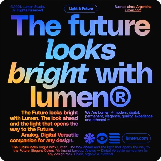
Lumen's promotional poster layers large, gradient-filled display type with electric-blue and orange accents on a near-black background, anchored by brand descriptors and a website URL.
Summary
Lumen's promotional poster layers large, gradient-filled display type with electric-blue and orange accents on a near-black background, anchored by brand descriptors and a website URL.
Visual description
A dark poster dominated by stacked display typography: "The future looks bright with lumen" in oversized letters, each word rendered in a different gradient or solid color (electric blue, light blue, soft pink/cream, orange-yellow). A registered trademark symbol punctuates "lumen" in blue. A rounded pill-shaped button labeled "Light & Future" in neon blue sits in the upper right. Below the main headline, three lines of smaller body copy in orange and blue describe Lumen's positioning ("The Future looks bright with Lumen..."), followed by three brand descriptors in blue ("We Are Lumen, modern, digital..."). At the lower right, a row of icon marks (a flower, eye, horizontal lines, and the brand URL button "lumen.com") in blue adds visual detail. A copyright line in small type credits Lumen Studio, Buenos Aires, Argentina. The near-black background maximizes the luminous quality of the blue and orange accents, reinforcing the "light and future" concept.
Key takeaway
Using gradient or color-varied letterforms in a single headline to create visual interest and emotional direction without additional imagery. The pairing of electric blue and warm orange on black as a high-energy, forward-looking color statement. Placing brand voice copy and icons below the main headline to reinforce a value proposition without competing with the typography.
Reuse notes
Effective for lighting, design services, or innovation-focused B2B brands that want to project confidence and modernity. The poster format and bold type treatment work well for presentation covers, website hero backdrops, or printed collateral that needs to stop and intrigue an audience. The gradient text technique elevates typographic work beyond solid color but can be overused; here it is restrained to a few key words and avoids feeling gimmicky. Best paired with structured body copy and clear CTAs to convert attention into action.
More like this



Keep what you find
A free account saves references to boards and can send you a weekly email of picks based on what you save.
To see every result, go Pro.