Preview image. Unlock full-res
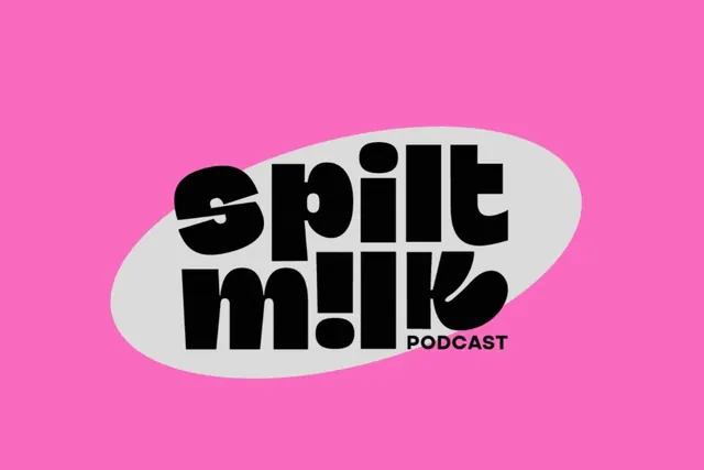
Podcast mark pairing bold jet-black sans-serif lettering in a soft gray oval against a vibrant hot pink background, with the word PODCAST as a smaller label.
Summary
Podcast mark pairing bold jet-black sans-serif lettering in a soft gray oval against a vibrant hot pink background, with the word PODCAST as a smaller label.
Visual description
The logo centers a large, soft gray oval containing the three words "Spill the Milk" in jet-black, geometric sans-serif at maximum weight. The typeface is modern and rounded, with substantial letterforms that nearly touch the oval's bounds. Below right sits the smaller label "PODCAST" in black. The entire badge floats against a hot pink background that extends edge-to-edge, creating maximum chroma contrast. The soft oval's pale gray tones soften the sharpness of the black type, while the hot pink pushes the whole mark forward.
Key takeaway
The tension between soft boundary (the gray pill shape) and hard typography (thick black sans) creates visual interest without fuss. The hot pink is aggressive without being garish because it is reserved for the background, letting the logo breathe. Oversized dimensioned type with minimal supporting elements makes for a confident, radio-ready mark.
Reuse notes
Perfect template for audio/podcast brands that want personality and high impact on social thumbnails and podcast directories. The color combination reads especially well at small sizes. Keep type at maximum weight and the supporting geometry minimal to avoid visual overload.