Preview image. Unlock full-res
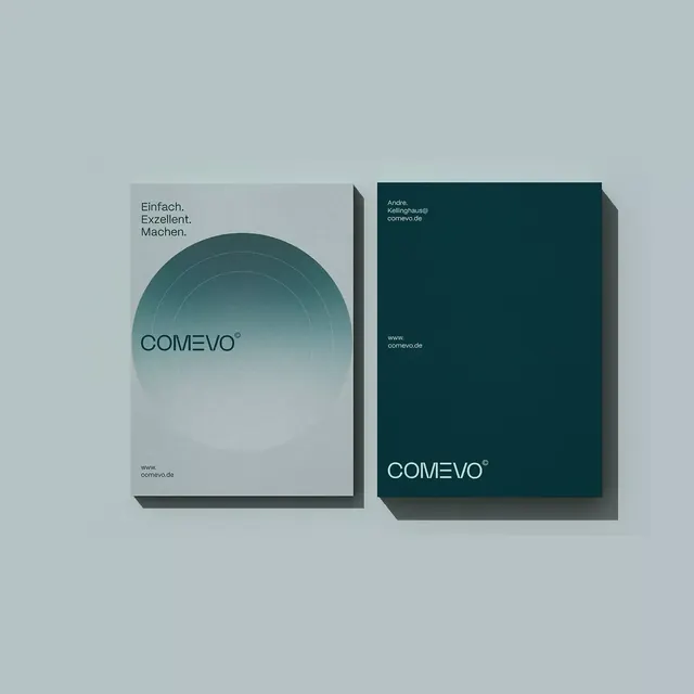
Dual business card mockup in muted teal and dark teal, featuring a concentric-circle graphic and clean sans-serif wordmark.
Summary
Dual business card mockup in muted teal and dark teal, featuring a concentric-circle graphic and clean sans-serif wordmark.
Visual description
Two business cards shown at a slight 3D angle with subtle shadow beneath each. Left card: light teal background with a large concentric circle graphic in the center (graduated concentric rings), the wordmark "COMEVO" below, and contact URL below that. German tagline text (Einfach. Exzellent. Machen.) sits above the graphic. Right card: deep teal or dark blue-green with minimal white typography, including contact info and website, wordmark repeated at lower right. Composition is split-color (light/dark teal) and highly symmetric. Both cards employ generous whitespace and refined alignment.
Key takeaway
The concentric-circle motif works as both a subtle brand symbol and a visual anchor on the light card. The split-tone color story (light and dark teal together) gives sophistication without feeling cold. Sans-serif wordmark in mixed case maintains legibility while feeling contemporary and clean.
Reuse notes
Suits consulting, technology, or professional services where trustworthiness and minimalism signal expertise. The concentric-circle mark is flexible and can be applied across collateral beyond cards. Works equally well printed or digital because of high contrast and clear geometry.
More like this






Keep what you find
A free account saves references to boards and can send you a weekly email of picks based on what you save.
To see every result, go Pro.