Preview image. Unlock full-res
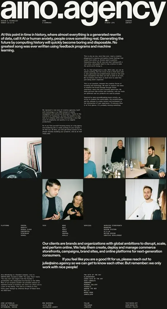
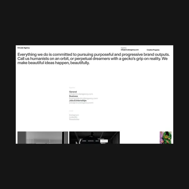
A creative agency website with a large white bold logotype anchoring a dark background, flowing into dense editorial copy, tagline, and a grid of team portraits.
Summary
Aino Agency's dark website pairs a bold logotype and manifesto copy with a grid of candid team photography, using white-on-black contrast to establish authority.
Visual description
Jet-black background with white sans-serif logotype dominating the top third. Large paragraphs of body copy in smaller sans-serif type fill the center, followed by a dense 3x3 grid of photographic portraits showing team members in casual moments. The portraits are laid out with some images full-width and others flanking whitespace. A footer section restates the agency's services and contact information in smaller type. Overall palette is strictly monochromatic, with photography providing the only visual interest and warmth through skin tones and natural lighting.
Key takeaway
The confidence of one bold mark paired with restraint in everything else. The team grid as a trust-builder positioned as the visual anchor after the manifesto. The type choices (likely a modern grotesque) sized dramatically to enforce hierarchy without color changes.
Reuse notes
Effective for professional services (agencies, studios, consulting firms) wanting to assert credibility through minimalism and authentic team imagery. Works well for long-form mission statements followed by proof-of-people. The dark background limits deployment (requires strong branding) but reads bold on any context where you want to signal premium positioning.
More like this



Keep what you find
A free account saves references to boards and can send you a weekly email of picks based on what you save.
To see every result, go Pro.