Preview image. Unlock full-res
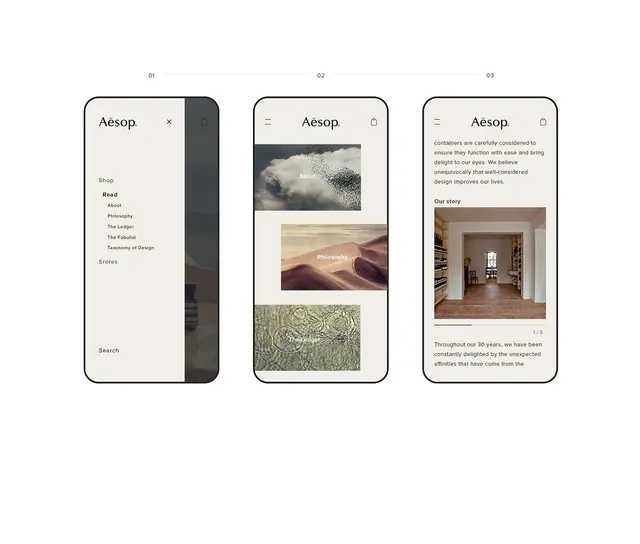
Three mobile screens showing Aesop's minimalist app interface with cream and dark sidebar navigation, stacked imagery, and restrained text hierarchy.
Summary
Three mobile screens demonstrating Aesop's editorial minimalist approach: a dark sidebar menu (01), an image-stacked philosophy section (02), and a brand-story narrative with embedded interior photography (03).
Visual description
Screen 01 presents a dark charcoal sidebar navigation on the right edge with a light cream body area listing Shop, Read (About, Philosophy, The Ledger, The Fabulist, Taxonomy of Design), Stores, and Search in left-aligned sans-serif. Screens 02 and 03 use the full cream width with a dark header bar containing the Aesop logotype and icon buttons. Screen 02 stacks three large photographic images (moody clouds, warm sand dunes, rippled water/patterns) each labeled with a category (About, Philosophy, The Ledger). Screen 03 presents grey body text describing containers and design philosophy, followed by an interior photograph labeled "Our story" with a slide counter (1/5) and paragraph text below. All three share clean rounded-rectangle frame outlines, centered logotype positioning, and restrained color: charcoal, warm cream, and small black text.
Key takeaway
The dark sidebar as a persistent nav container without overwhelming the content. The discipline of stacking full-width photography without captions, letting images speak for their category. The use of warm, muted earth tones (tan, grey, cream) that feel hand-made rather than digital, anchoring the luxury/editorial mood.
Reuse notes
Suited for heritage or design-forward brands in luxury, beauty, or craft verticals. The sidebar works well for longer category lists or when you want to establish a distinct secondary visual layer. Cream and charcoal is striking and memorable but works best when your photography or imagery is warm and textured; very cool-toned or high-contrast photography will clash.
More like this






Keep what you find
A free account saves references to boards and can send you a weekly email of picks based on what you save.
To see every result, go Pro.