Preview image. Unlock full-res
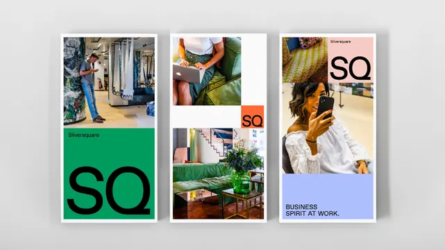
Three-column brand identity system for a design agency, combining lifestyle photography, sage-green geometry, and sans-serif wordmark.
Summary
Three-column brand identity system for a design agency, combining lifestyle photography, sage-green geometry, and sans-serif wordmark.
Visual description
Horizontal triptych of three equal vertical columns on a light off-white ground. Left panel: three stacked lifestyle photographs (textured interior details, plants, people in profile) anchored by a large sage-green 'SQ' monogram and delicate serif accent type below. Center panel: a grid of four smaller photographs and a single solid sage-green rectangle at bottom-left, presenting a mosaic of lifestyle moments and textures. Right panel: full-height lifestyle photography with an overlay of minimalist sans-serif typography and a small orange accent square. All text is set in a clean, modern sans-serif; the color palette balances muted taupes and off-whites with a dominant sage-green and warm-wood browns. The layout is rigorous and modular, with consistent margins and alignment.
Key takeaway
The sage-green-and-neutral color system as a contemporary alternative to corporate blues. The asymmetric three-column grid that balances photography, geometry, and type. The restraint of using only one bold accent color (the green) with a secondary warm tone (brown) for depth.
Reuse notes
Exemplary for design studios, architectural firms, or lifestyle brands seeking understated sophistication. The photography-forward approach requires curated, consistent lifestyle imagery to maintain coherence. The modular grid scales well to single-column or six-column adaptations.
More like this






Keep what you find
A free account saves references to boards and can send you a weekly email of picks based on what you save.
To see every result, go Pro.