Preview image. Unlock full-res
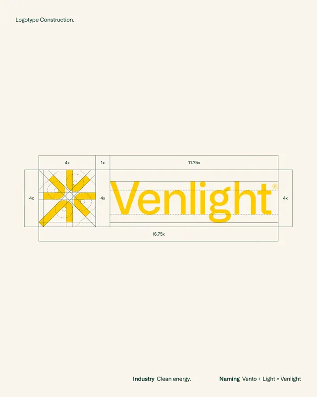
Venlight brand identity showcasing a radial geometric sunburst logo with modular grid construction overlaid with measurement annotations and proportional spacing guides.
Summary
Venlight brand identity showcasing a radial geometric sunburst logo with modular grid construction overlaid with measurement annotations and proportional spacing guides.
Visual description
A horizontal branding guideline sheet with a pale cream background. On the left, a geometric sunburst logo composed of 12 golden-yellow triangular rays radiating from a white circle center, enclosed in a square frame. A vertical and horizontal axis runs through the center. On the right, the wordmark "Venlight" rendered in bold, display sans-serif type in the same golden yellow. The entire composition is bracketed by a grid of thin black rules and dimensioned with measurements (4x, 1x, 11.75x, 10.75x) at the edges, demonstrating proportional spacing and construction ratios. Below, small text indicates "Industry: Clean energy" and a name breakdown "Naming: Vento + Light = Venlight".
Key takeaway
The explicit grid-based construction system layered over the logo and wordmark, making proportional relationships clear and reproducible. The radial geometry of the sunburst, created from simple triangular segments at consistent angles. The choice of a single bold geometric sans-serif paired with a symbol that reinforces the brand concept (rays as energy, warmth, and renewal).
Reuse notes
Ideal for technology, energy, sustainability, or fintech brands seeking a modern, systems-based identity. The grid approach works well when you need to communicate how the logo was built or establish strict proportional rules for partners. Golden yellow on pale cream reads cleanly but has low accessibility; darker text or deeper cream background if accessibility is a concern.