Preview image. Unlock full-res
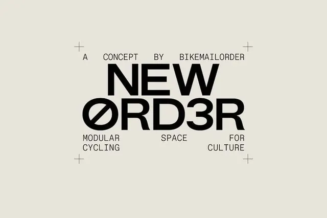
A striking cycling-brand concept wordmark using a heavy geometric sans-serif with an O slashed through the middle, framed by delicate cross brackets on a neutral backdrop.
Summary
A modular cycling-brand wordmark "NEW ØRD3R" using thick geometric sans-serif with a distinctive slashed O as the mark, flanked by minimalist cross-hairs on a warm beige field.
Visual description
Centered composition on a warm off-white ground. A small line of text reading "A CONCEPT BY BIKEMAILORDER" sits above the primary wordmark in a narrow, precise sans-serif. The main mark is rendered in a very heavy geometric sans-serif with high stroke contrast, reading "NEW ØRD3R" with the O crossed by a diagonal slash (doubling as a design element and the number 3 as a substitute). Descriptive text ("MODULAR SPACE FOR CULTURE") appears below in smaller weight. Four delicate cross-hairs (plus signs) mark the corners, creating a sense of geometric framing and module precision. The entire composition is balanced and meticulously centered, emphasizing order and technical precision.
Key takeaway
The slash through the O as both a literal mark and a rebus (the 3). The use of delicate cross-hair marks to create invisible grid structure without being heavy-handed. The pairing of ultra-bold primary type with hairline secondary type to establish clear hierarchy and reinforce the modular concept.
Reuse notes
Strong for tech, cycling, or sports-culture branding where precision and "order" are part of the narrative. The geometric detail works well at small scales (favicon, badge) as well as large (poster, signage). The beige-on-black balance feels contemporary and appropriate for millennial/Gen Z brand audiences. Less suitable for traditional corporate identities where such striking geometric play might read as too trendy.
More like this








Keep what you find
A free account saves references to boards and can send you a weekly email of picks based on what you save.
To see every result, go Pro.