Preview image. Unlock full-res
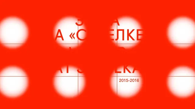
Academic identity system using vibrant red as a primary brand color with a grid of blurred-white circles as a recurring mark, paired with serif and sans-serif typography.
Summary
An academic identity system using a bold red field with blurred-circle motifs, Cyrillic typography, and date notation, demonstrating institutional branding through high-contrast geometric forms.
Visual description
A 2x4 grid of soft white circles with gaussian blur creates a repeating mark on a pure bright red background. Overlaid typography spans the grid in serif and sans-serif weights, including Cyrillic characters (ЯЛКЕ), Latin shorthand (A «C), and a date (2015-2016) in a secondary serif. The circles are evenly spaced, creating visual rhythm and suggesting depth through the glow effect against the flat saturated field.
Key takeaway
The blurred-circle motif provides visual warmth and organic softness to an otherwise geometric, technical composition. The institutional palette (pure red, pure white) with serif-sans-serif pairing signals educational authority while remaining contemporary. The grid-based repetition makes the mark work as a flexible system.
Reuse notes
Strong for academic, cultural, or institutional brands seeking bold color contrast. The blurred circles pair well with minimal typography and structured layouts. Works best with plenty of breathing room; the red is saturated enough to dominate, so use as an accent color in supporting contexts rather than all-over.
More like this





Keep what you find
A free account saves references to boards and can send you a weekly email of picks based on what you save.
To see every result, go Pro.