Preview image. Unlock full-res
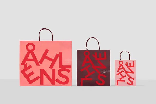
Three reusable shopping bags in different sizes displaying a bold red geometric typography system on coral and dark backgrounds.
Summary
A cohesive brand identity system applied across three shopping bag sizes, demonstrating consistent geometric typography at different scales.
Visual description
Three paper shopping bags are arranged in decreasing size from left to right. Each bag displays the same bold, geometric sans-serif wordmark in red, scaled proportionally to the bag size. The largest bag has a coral background with darker red type, the middle bag features a dark brown background with red type, and the smallest bag uses a light pink background. The design showcases consistent proportional scaling and visual harmony across formats.
Key takeaway
A geometric, bold wordmark can maintain visual impact across drastically different scales when properly proportioned, making it ideal for comprehensive brand applications.
Reuse notes
Excellent reference for designing scalable branding systems for retail, e-commerce, or product packaging where the same mark needs to work across multiple physical formats.
More like this





Keep what you find
A free account saves references to boards and can send you a weekly email of picks based on what you save.
To see every result, go Pro.