Preview image. Unlock full-res
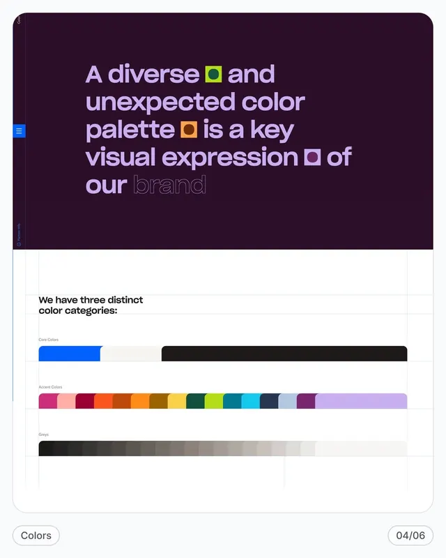
A two-page brand guidelines spread showing core colors, a vibrant accent palette, and neutral greys with explanatory copy on color philosophy and usage.
Summary
A two-page brand guidelines spread showing core colors, a vibrant accent palette, and neutral greys with explanatory copy on color philosophy and usage.
Visual description
The upper half is a deep plum-purple background carrying white and lavender headline text. Colored squares and outlined shapes punctuate the text, explaining the brand's use of contrasting colors as a visual identity tool. Below, the lower page is white and shows three distinct color bands: a narrow "Core Colors" bar (bold blue and jet black), a long "Accent Colors" strip spanning 14+ hues from magenta through lime to light purple, and a "Greys" tonal ramp from black to near-white. A small "04/06" page number appears bottom-right, suggesting this is a multi-page system.
Key takeaway
The color-first brand strategy: stating the palette before the logo or wordmark, and using both saturated and desaturated swatches to demonstrate the breadth and control of the system. The page layout separates philosophy (top) from specification (bottom), making both reference-friendly.
Reuse notes
Effective for brands where color is the primary differentiator or a core part of the identity statement. Works best when the palette genuinely spans warm, cool, and neutral tones. Works less well for brands requiring subtle, monochromatic palettes.
More like this




Keep what you find
A free account saves references to boards and can send you a weekly email of picks based on what you save.
To see every result, go Pro.