Preview image. Unlock full-res
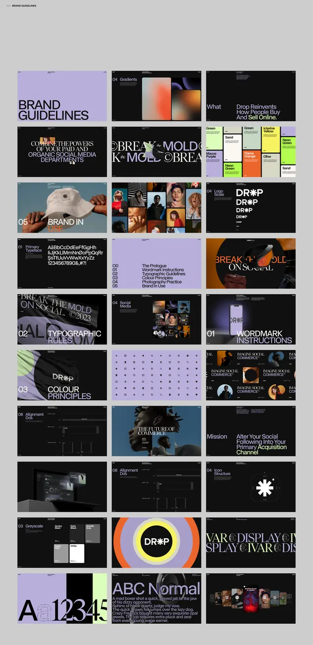
A contact-sheet grid of brand-guideline spreads for DROP, mixing lavender, black, and neon-yellow pages across logo, typography, and color-principle sections.
Summary
A vertical contact sheet showing roughly thirty pages of a brand-guidelines deck for a brand called DROP, surveying its logo, typographic rules, and color principles in one scrollable mosaic.
Visual description
Pages are tiled in a multi-column grid on a light gray backdrop, each spread sized like a 16:9 slide. The system alternates three keynote palettes: pale lavender, solid black, and a punchy neon yellow, with occasional photographic tiles (a white duck, portraits, dark product shots). Spreads carry numbered section headers in heavy uppercase ("01 BRAND IN", "02 TYPOGRAPHIC RULES", "03 COLOUR PRINCIPLES", "WORDMARK INSTRUCTIONS"). The DROP wordmark is repeated and distorted across several pages; one page stacks a giant "A 12345" type specimen, another shows a dot-grid color chart, another a "VAR DISPLAY" type page. Sans-serif throughout, with a recurring tension between tidy grids and broken, stretched logo lockups.
Key takeaway
Presenting an entire guidelines deck as a single contact-sheet image is itself the move: it sells the system's range and rhythm at a glance before anyone opens a page. The disciplined three-color rotation (lavender / black / neon-yellow) keeps thirty varied spreads feeling like one family.
Reuse notes
Use as a reference for structuring a social-brand or agency guideline deck, or as a portfolio cover image that proves depth of work in one frame. The individual spreads are small here, so treat it as layout-and-system inspiration rather than a source for fine type detail.
More like this





Keep what you find
A free account saves references to boards and can send you a weekly email of picks based on what you save.
To see every result, go Pro.