Preview image. Unlock full-res
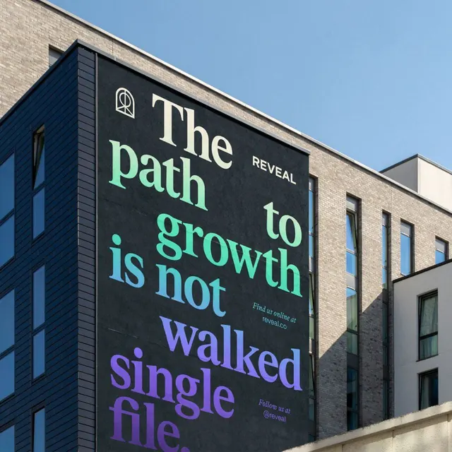
Building-sized billboard display: stacked typographic hierarchy in neon green and blue against dark background with architectural context, promoting a company or movement.
Summary
Building-sized billboard display: stacked typographic hierarchy in neon green and blue against dark background with architectural context, promoting a company or movement.
Visual description
A large-scale exterior sign mounted on the corner of a brick and stone building under clear blue sky. The sign surface is dark charcoal with white and colored neon lettering. Large letters read "The" (white) followed by "path" (bright mint green), then "to" (white), "growth" (mint green), "is" (white), and "not" (white with a purple accent). The final words "walked" (purple) and "single file" (purple) complete the statement. An icon appears above the text. Small lowercase text at the bottom reads "Find us online at reveal.cc" and includes social handles. The architectural surroundings reinforce the scale and permanence of the message.
Key takeaway
Color blocking (green and purple) creating emphasis on key words within a single message; vertical stacking and line breaks controlling pace and hierarchy without additional visual elements; the commitment to large-scale typography as the primary brand expression.
Reuse notes
Powerful for growth-focused brands, consulting firms, or advocacy organizations. The neon color palette and multi-line breakdown work best for messages with inherent rhythm or narrative arc. Strong impact at building scale; scale down carefully, as the approach can feel overwrought on smaller applications.
More like this


Keep what you find
A free account saves references to boards and can send you a weekly email of picks based on what you save.
To see every result, go Pro.