Preview image. Unlock full-res
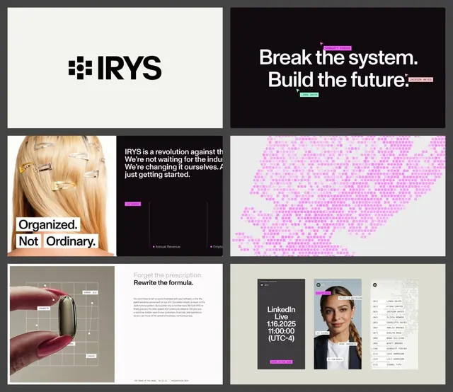
A six-up grid of brand-deck slides for IRYS, pairing a bold sans wordmark and cream/black layouts with hot-pink highlight tags and a dotted map graphic.
Summary
A six-panel presentation of an IRYS brand system, alternating cream and near-black slides anchored by a heavy sans wordmark and punctuated by hot-pink highlight tags.
Visual description
Six deck frames are arranged in a 2x3 grid on a mid-grey backing. Top left places the IRYS wordmark, a chunky square-edged geometric sans beside a stacked-tile glyph, centered on cream. Top right runs an oversized black slide reading "Break the system. Build the future." in bold white type, with small magenta and mint name tags ("SCARLETT FOSTER", "JACKSON HAYES", "LINDA DAVID") clipped onto the words like chat labels. The middle row mixes a cropped blonde-hair photo with white knockout boxes ("Organized. Not Ordinary.") against a black copy slide, then a pink dotted map rendered entirely in square pixels. The bottom row shows a hand pinching a capsule over a wireframe grid, a "Forget the prescription / Rewrite the formula" headline slide, and a trio of phone-and-ID mockups with a numbered name list. Pink highlight chips recur throughout as the single accent.
Key takeaway
The clipped-tag treatment, small colored labels physically attached to headline words, gives a static deck a tactile, annotated feel. One saturated pink against a strict cream/black system reads confident without going maximalist. Rendering a map as a pink pixel grid keeps an illustration on-brand with the type system.
Reuse notes
A strong template for a startup brand or pitch deck that needs to feel modern and editorial at once. Pairs well with oversized condensed headlines and minimal photography. Caveat: the pink accent does heavy lifting, on a muddier palette the tags lose their pop.
More like this





Keep what you find
A free account saves references to boards and can send you a weekly email of picks based on what you save.
To see every result, go Pro.