Preview image. Unlock full-res
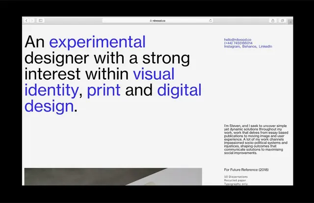
A designer's portfolio homepage (rdwood.co) with left-aligned text hierarchy, blue accent keywords, gray diagonal divider, and contact links.
Summary
A designer's portfolio homepage (rdwood.co) with left-aligned text hierarchy, blue accent keywords, gray diagonal divider, and contact links.
Visual description
The page displays a bio header on a light gray background. Large serif headline in black left-aligned reads "An experimental designer with a strong interest within" followed by highlighted blue phrases: "visual identity, print" and "digital design". Below, a detailed paragraph describes the designer's interests in socio-political systems and work philosophy. Upper right shows contact info (email, phone, social links). Lower left anchors a gray diagonal shape slanting from top-right to bottom-left, creating compositional tension. Typography mixes serif display copy with smaller sans body text; the blue accent color creates visual hierarchy and guides the eye through key concepts.
Key takeaway
The selective blue-text highlighting of key professional interests creates scannable content hierarchy without additional visual elements. The diagonal gray shape provides compositional weight without disrupting the clean, minimal aesthetic. The serif-first approach with blue accents conveys sophistication in a personal brand context.
Reuse notes
Reference for designer portfolios, agency bios, and professional identity pages. The colored-keyword technique works especially well when the background is neutral and the copy is substantial. The diagonal element adds dynamism without compromising minimalism; scale it to balance the text block.
More like this



Keep what you find
A free account saves references to boards and can send you a weekly email of picks based on what you save.
To see every result, go Pro.