Preview image. Unlock full-res
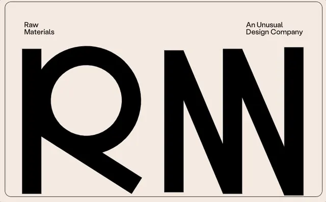
Heavy, geometric sans-serif letters R and N at extreme scale on warm beige background with dual brand labels, emphasizing counter-space and letterform geometry.
Summary
Heavy, geometric sans-serif letters R and N at extreme scale on warm beige background with dual brand labels, emphasizing counter-space and letterform geometry.
Visual description
Two massive black sans-serif letters dominate a warm beige background with rounded corners: a broad R with a circular counter-space, and a tall N with sharp diagonals. Small black text labels appear in opposite corners: "Raw Materials" at top-left and "An Unusual Design Company" at top-right. The letter forms are chunky and geometric with thick strokes, allowing the beige background to read as positive space within the letters themselves. Composition is symmetrical and locked-tight with no visible margin.
Key takeaway
The use of counter-space as active positive (not negative) space. Huge single or paired letters as a branding device, especially effective with industrial or craft-adjacent studios. The warm neutral (beige) as a sophisticated alternative to white when paired with black type.
Reuse notes
Perfect for design studios, creative agencies, or type foundries wanting to showcase their own letterforms. The geometric sans works well for contemporary or tech brands. Scale works only on large format (print, signage) where the letters remain legible. The dual-label strategy suits multi-entity or portfolio brands.
More like this



Keep what you find
A free account saves references to boards and can send you a weekly email of picks based on what you save.
To see every result, go Pro.