Preview image. Unlock full-res
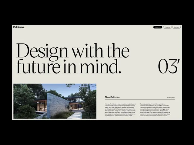
Feldman Architecture uses a high-contrast serif display type for 'Design with the future in mind' paired with a striking architectural photograph and dense body copy on a light beige background.
Summary
Feldman Architecture presents its firm identity through an oversized serif headline about design philosophy, a photographic case-study image, and body copy describing its collaborative residential and commercial practice on a light beige grid.
Visual description
The header holds "Feldman." in a small sans-serif logotype, with buttons for "About FA", "Projects", and "Contact" top-right. The main headline spans the width in a high-contrast serif typeface: "Design with the future in mind." followed by a code marker "03". Below is a two-part layout: on the left, a rectangular photograph of a modern house with glass and timber, lit by natural daylight and surrounded by landscape; on the right, body text explaining the firm's approach ("About Feldman. A family firm."), methodology, and values. The background is a warm off-white or light beige, the type is strictly monochromatic black, and the overall composition respects generous whitespace and grid alignment.
Key takeaway
A single oversized serif typeface used at display scale creates immediate gravitas and differentiates from the default sans-serif norm. The measured column of body copy balanced against a strong image anchors both the page hierarchy and the reader's trust. Navigation and branding are kept minimal and matter-of-fact, letting the content speak.
Reuse notes
Effective for architecture and design firms, consulting, and high-end real-estate brands that value craft and thoughtful process. Works best with high-quality, architectural photography that complements the formal serif aesthetic. The light beige background adds warmth to an otherwise stark monochrome palette.
More like this








Keep what you find
A free account saves references to boards and can send you a weekly email of picks based on what you save.
To see every result, go Pro.