Preview image. Unlock full-res
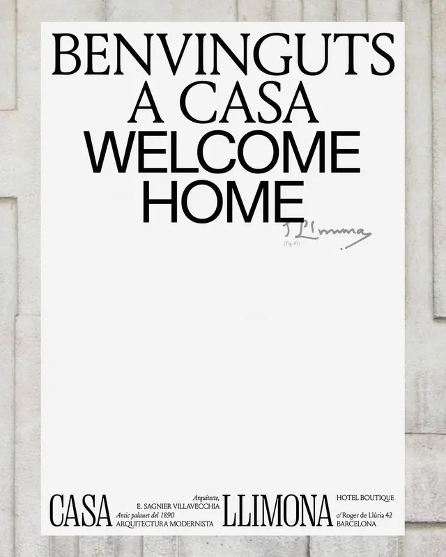
A typographic poster for a Barcelona hotel built by modernist architect Sagnier, pairing a large serif headline with delicate handwritten signature and foundational institutional details, scaled to emphasize hierarchy through restraint.
Summary
An architectural identity poster for Casa Llimona, a modernist hotel in Barcelona, organized as a vertical hierarchy from headline through foundational credits, balancing display serif type with delicate script and crisp institutional sans-serif.
Visual description
A portrait-oriented poster mounted on a subtle beige stone textured background. The upper half contains the headline "BENVINGUTS / A CASA / WELCOME / HOME" set in a large, bold serif typeface with generous spacing and strict vertical alignment. A delicate cursive signature reading what appears to be "E. Llimona" (or similar) appears offset below, handwritten in fine script. The lower third shifts to smaller scale, revealing institutional copy: "CASA" on the left, a centered architectural credit referencing "Arquitecte E. SAGNIER VILLAVECCHIA" and "Antic palauet del 1890 / ARQUITECTURA MODERNISTA," and "LLIMONA" on the right with address details "c/Roger de Lluria 42 / BARCELONA" and the designation "HOTEL BOUTIQUE." The composition is centered and symmetrical, with ample negative space amplifying the restraint of the layout.
Key takeaway
The hierarchical stacking of information through scale shifts, where large headline commands attention and body copy shrinks appropriately without losing presence. The pairing of a confident serif headline with delicate cursive and crisp footnote typography establishes institutional authority while retaining human warmth. The typography's verticality and centered anchoring create a formal, timeless elegance without ornament.
Reuse notes
Ideal for heritage hospitality, cultural institutions, or architectural brands seeking sophisticated restraint. The serif-plus-script combination reads as both historic and refined; works especially well in print (posters, cards, signage). The stone texture background gives an architectural grounding appropriate to real estate or gallery contexts. Requires legible serif type to maintain the sophistication; the approach breaks down if type becomes small or crowded.
More like this





Keep what you find
A free account saves references to boards and can send you a weekly email of picks based on what you save.
To see every result, go Pro.