Preview image. Unlock full-res
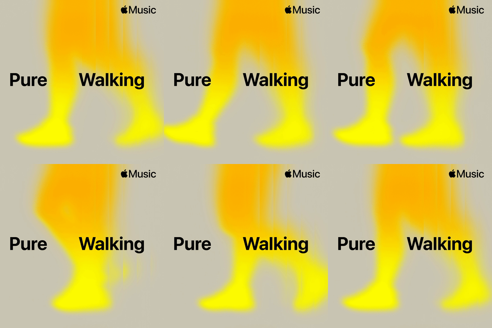
A music playlist type specimen pairing bold black display sans-serif with an abstract neon-yellow organic shape against neutral gray background.
Summary
A music playlist type specimen pairing bold black display sans-serif with an abstract neon-yellow organic shape against neutral gray background.
Visual description
Light gray rectangular field framing the composition. The Apple Music logo (small, black, upper right) anchors the branded context. Two words in heavy black sans-serif type are positioned left and right of center: "Pure" on the left, "Walking" on the right. Between and slightly behind the text sits a large, soft-edged organic shape in bright neon yellow, its form suggesting a rounded vertical element, slightly rotated. The abstract shape's fluidity contrasts sharply with the rigid typography, creating visual tension and movement despite a static composition.
Key takeaway
The energy created by pairing geometric display type with a soft, flowing abstract form is memorable and contemporary. The bright single-accent color (neon yellow) provides maximum impact on a neutral background without requiring a full color palette. The off-center, almost floating placement of the shape makes the composition feel dynamic rather than symmetrical and static.
Reuse notes
Strong for music, wellness, and lifestyle brands targeting younger audiences. The bold sans-serif type reads clearly at all sizes, while the abstract yellow shape serves as a visual hook and brand mark. Works especially well for playlists, apps, or digital-first brands. The high contrast makes it legible on both light and dark backgrounds. Less suitable for luxury or institutional contexts; best in youthful, energetic, or playful brand strategies.
More like this





Keep what you find
A free account saves references to boards and can send you a weekly email of picks based on what you save.
To see every result, go Pro.