Preview image. Unlock full-res
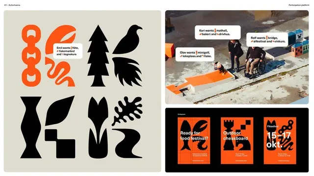
A two-panel campaign design pairing an abstract symbol grid of black organic shapes with event photography and text overlays on a warm neutral ground.
Summary
A promotional collage featuring a library of black organic abstraction shapes on the left panel alongside event photography and statement text on the right, unified by a warm beige base and bold sans-serif typography.
Visual description
Left panel: a grid of eight black silhouette shapes suggesting botanical and geometric forms. Center: a geometric wave-like divider. Right panel: full-bleed event photography with three white text labels overlaid on people and scenes, below a dark banner with event details and white sans-serif copy describing the event's mission and call-to-action. The warm neutral (beige/tan) background anchors the entire composition, allowing the black shapes and photography to read with sharp contrast.
Key takeaway
The modular symbol set is infinitely reusable across applications and signage. The pairing of abstract geometric language with documentary photography creates narrative tension and visual interest. Simple color discipline (black shapes, white text, one warm neutral) lets complex information remain scannable.
Reuse notes
Strong model for event identity systems, festival branding, and nonprofit campaigns. The shape library can scale from business cards to environmental graphics. Works well paired with documentary photography or portraiture where human connection is important. Less effective if primary-color blocking or polished product photography is the brand's strength.
More like this




Keep what you find
A free account saves references to boards and can send you a weekly email of picks based on what you save.
To see every result, go Pro.