Preview image. Unlock full-res
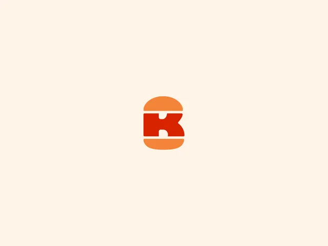
A standalone Burger King symbol on cream, with a red K held between an orange top and bottom bun.
More like this
See all

Summary
The reduced form of the identity: a single K set between two bun halves, sized small and centered in a wide cream field.
Visual description
A flat cream ground fills the frame. Dead center sits a compact two-color mark roughly a tenth of the frame width. An orange dome forms the top bun, flattened at its base; below it a solid red K sits as a squared slab whose diagonal arm sweeps out to the right and whose notch cuts in from the left as negative space, giving the letter soft rounded corners. A second orange shape, a half-round with a flat top, forms the bottom bun. Thin cream gaps separate the three elements so the burger stack reads as clearly as the letter. There is no wordmark, no descriptor and no container; the surrounding space is empty on all sides.
Key takeaway
The mark works twice over: the same red shape is a K and the patty of a burger, and the two thin cream gaps are what make the stack legible rather than any outline. Presenting it small in a large empty field is a confidence move that also proves it survives at small sizes.
Reuse notes
Reach for this when a logo presentation page needs to show the reduced symbol on its own, or as a reference for building a letterform and object into one shape. The tiny-in-a-big-field framing only reads as intentional when the mark is genuinely simple; a detailed mark would just look lost.