Preview image. Unlock full-res
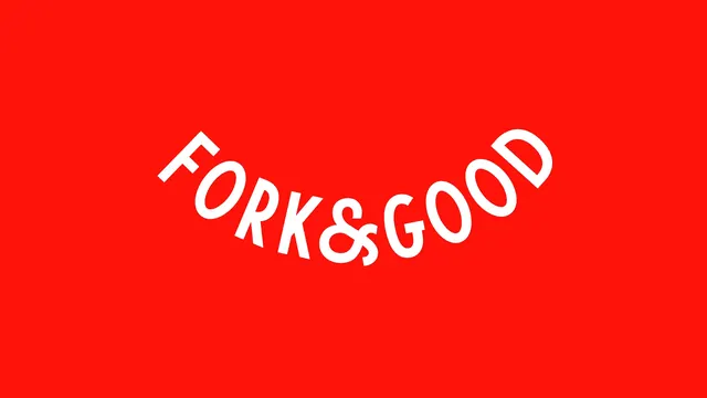
The Fork & Good wordmark alone in white on a flat red field, set on a smile shaped curve.
More like this
See all
Summary
The wordmark presented on its own: white caps on flat red, arranged along a downward then upward curve so the whole lockup reads as a smile.
Visual description
A wide frame of unbroken saturated red with the wordmark centered and occupying roughly the middle half of the width. The letters are a heavy geometric sans with generous round bowls, tight apertures, and flat terminals. They sit on a shallow U shaped baseline: each letter is individually rotated to stay perpendicular to that curve, so the F at the left leans right and the final D at the right leans left, while the ampersand at the lowest point sits upright. The ampersand is noticeably smaller than the caps around it and drops slightly below the curve, acting as the hinge between the two words. There is no space character, no tagline, no fork mark, and no framing rule. Margins above and below the type are deep and unequal, with more space beneath than above.
Key takeaway
Curving the baseline turns a plain two word name into a gesture, and shrinking the ampersand to sit at the low point of the curve gives the arc its pivot. A single flat color background is enough presentation for a mark this self contained.
Reuse notes
The reference frame for a wordmark reveal in a deck or case study. Works only for short names; a longer wordmark on this curve would either flatten out or start losing legibility at the ends. Keep the field flat, since any gradient or texture would compete with the arc.